tônica antarctica
Project developed via QuesttoNó
tônica antarctica is the first brazilian tonic water. launched in 1914, it is a best selling brand but its long existence called for a reinvention that puts it into a contemporary context. it was time to prepare a new strategy for tônica antarctica, repositioning the brand through a human-centered system.
research
what does it mean to be a grown-up?
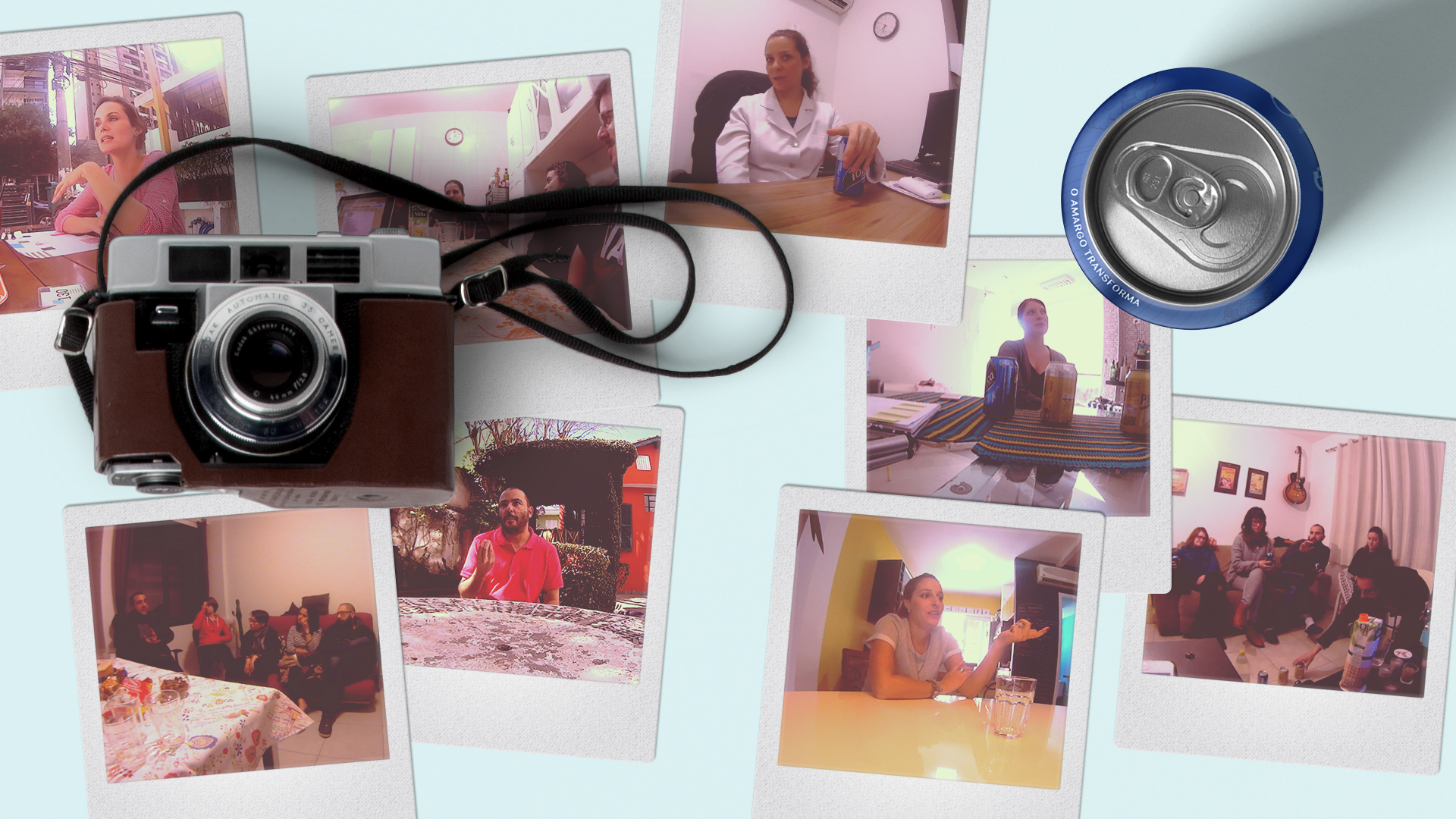
this was the first of many conflicts embraced by this project. during a broad research process of in-depth interviews and contextual immersion, we’ve spoken to young adults and found out that knowing how to taste and appreciate bitterness is the result of a palate development. it is part of a deeper movement in which personal interests change as adult life starts.
amidst personal dreams and the time dedicated into making them come true, the ambition for independency and eminent responsibilities, the transition to adulthood can be frustrating. for those who remain open to learn and change, a sense of accomplishment can be experienced in a more genuine and less painful way.
tagline
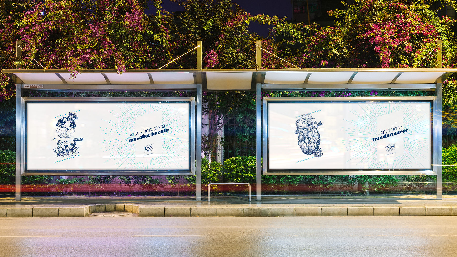
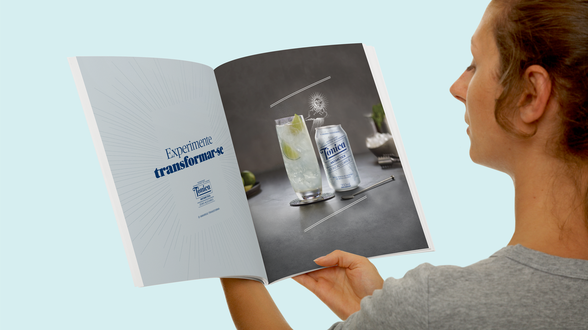
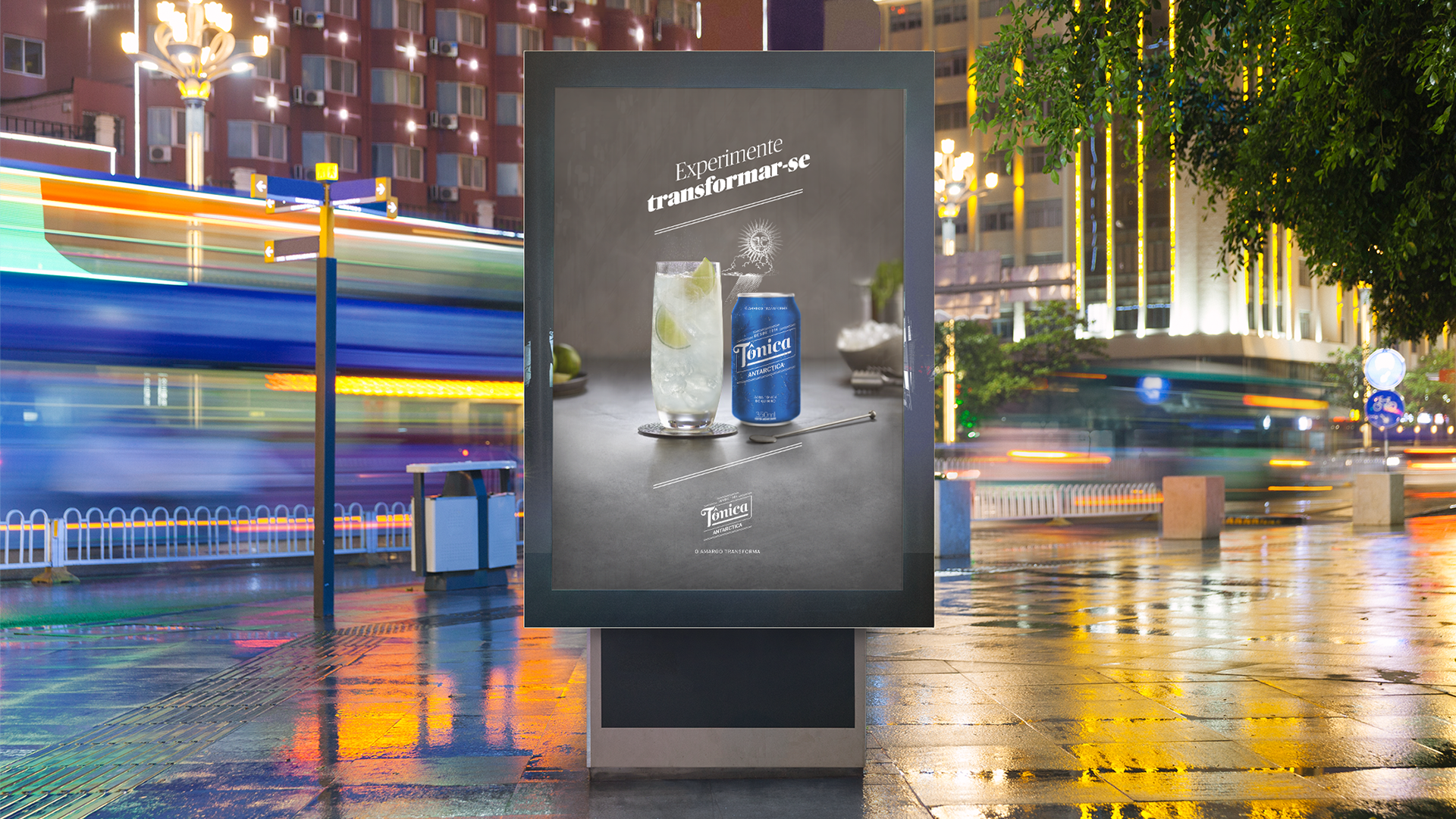
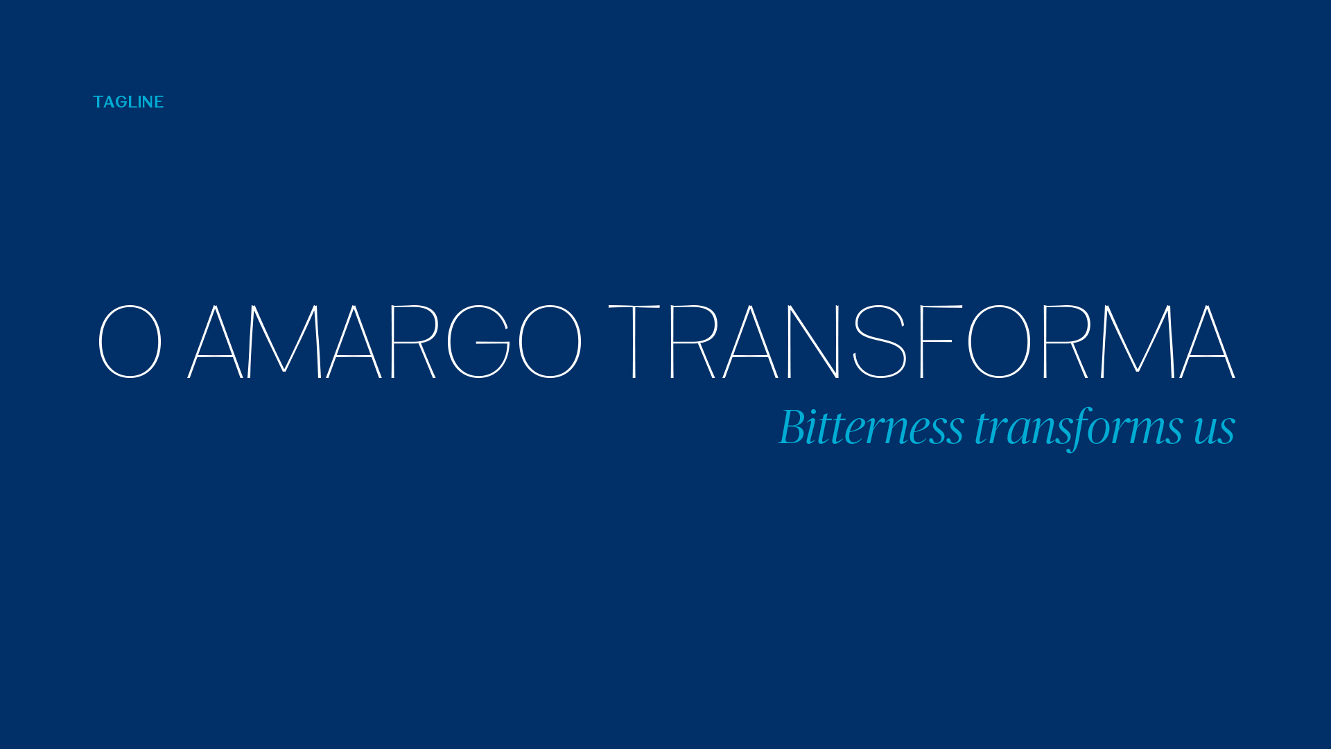
based on this discovery, we came up with a new brand purpose: revealing to young adults that tough moments in life are a source of growth and learning. tônica can inspire people to perceive life as an endless sequence of changes, not of rewards. the idea is synthesized by the tagline “bitterness transforms us”, associating tônica’s distinctive flavor to this specific question on people’s lives.
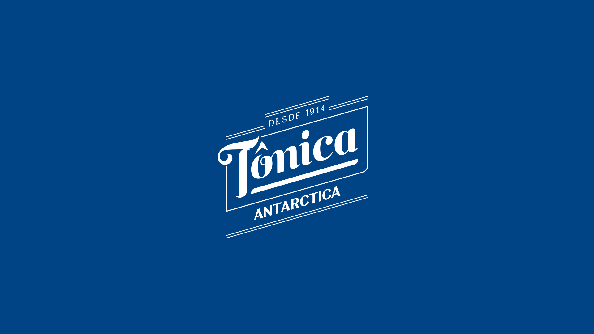
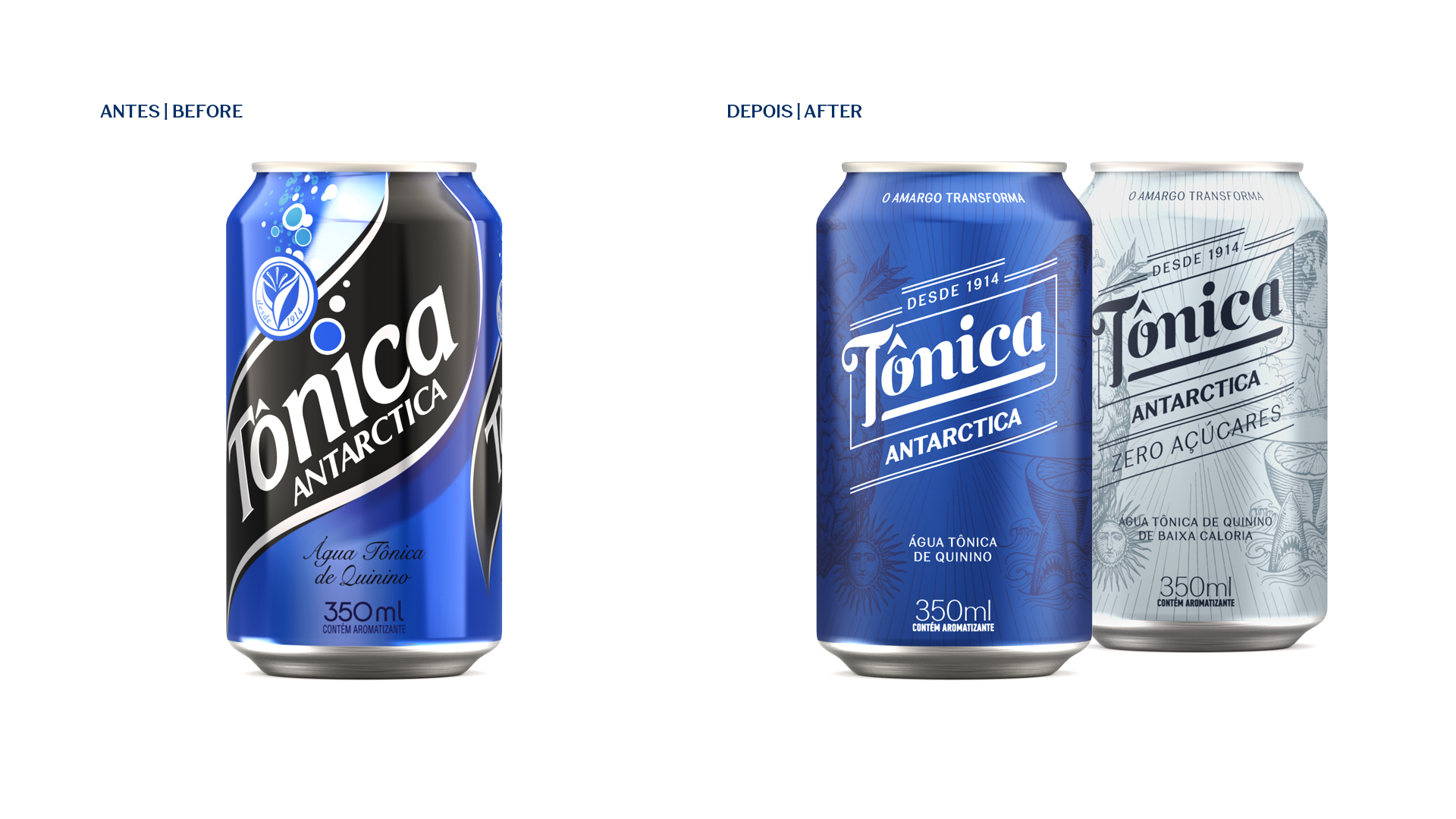
a new classic
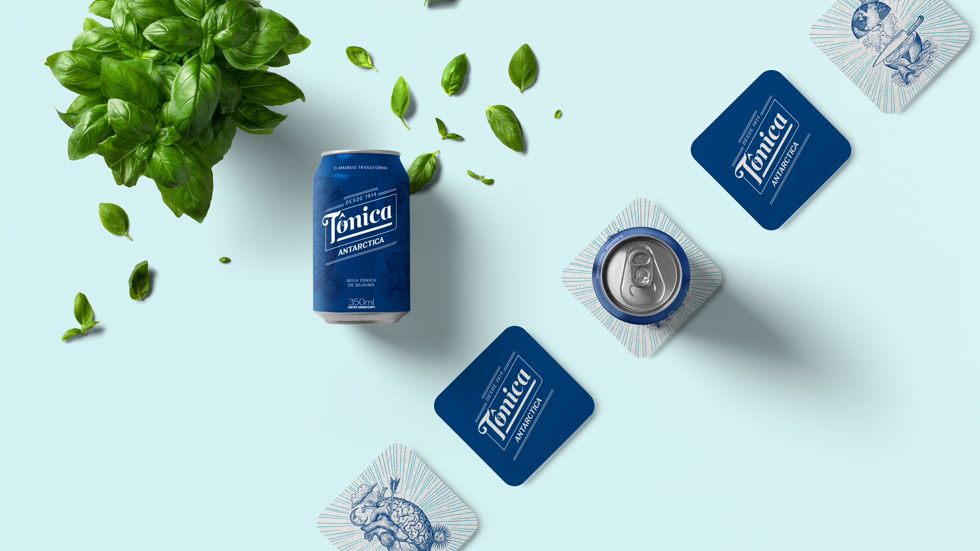
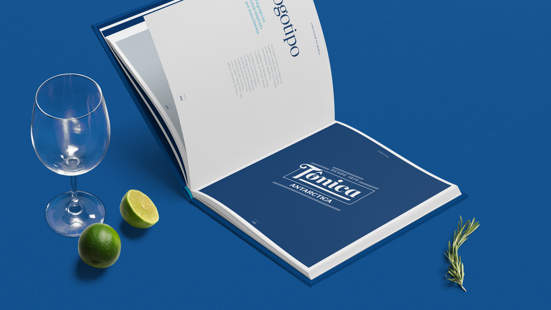
the logo was created inspired by the story of tônica antarctica. its tracing refers to codes of tradition and sophistication, present in the high contrast between its stems and calligraphic terminations. the angulation of the logo refers to movement. the contoured frame surrounds the logo and delivers classic looks through a contemporary interpretation of a traditional seal, culminating in the "since 1914" claim that reinforces the brand's heritage.
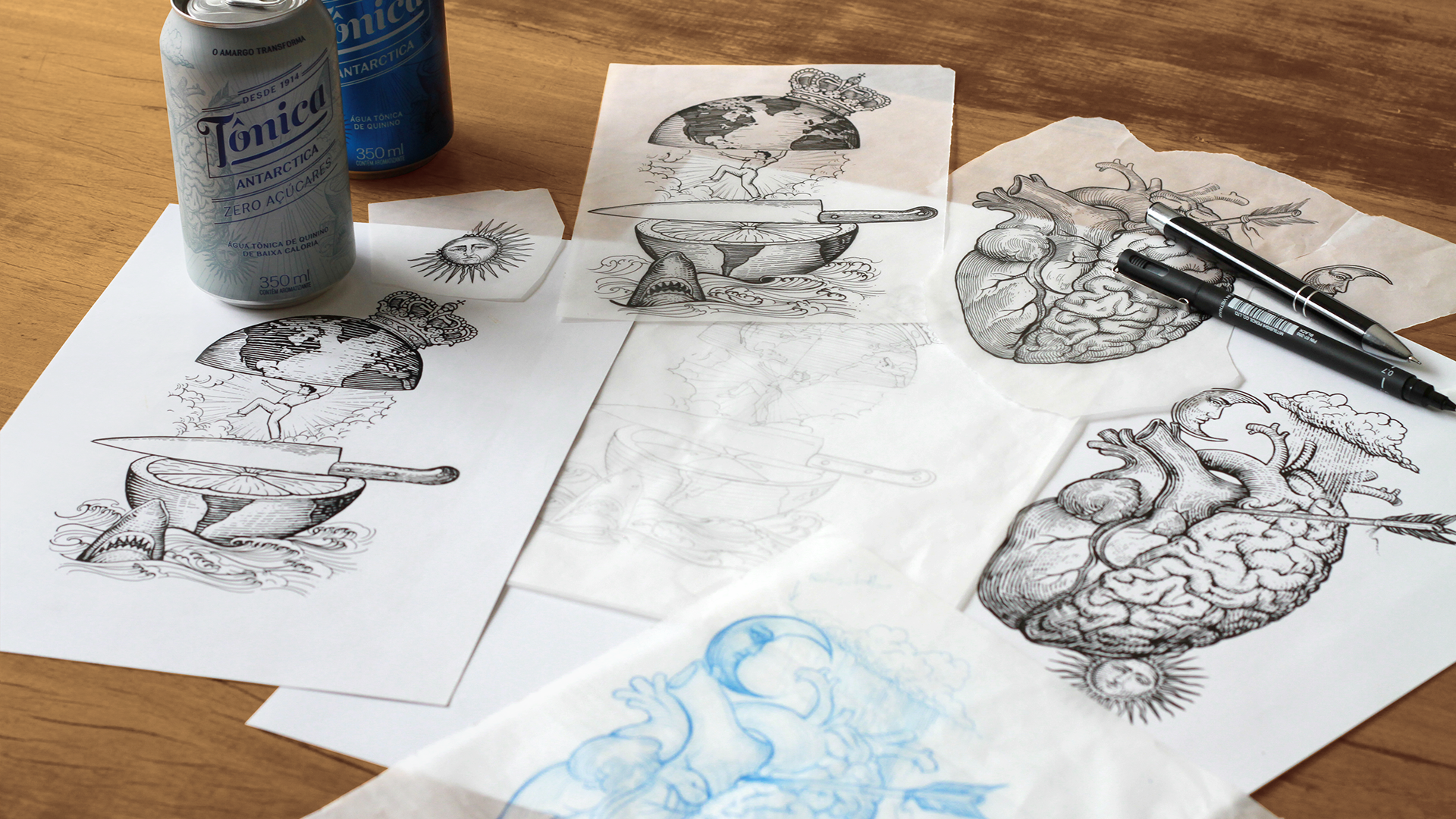
the illustrations were designed by questtonó's team and executed by the tattoo artist alex lazarini.
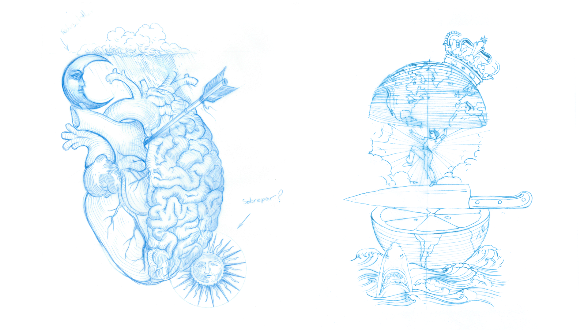
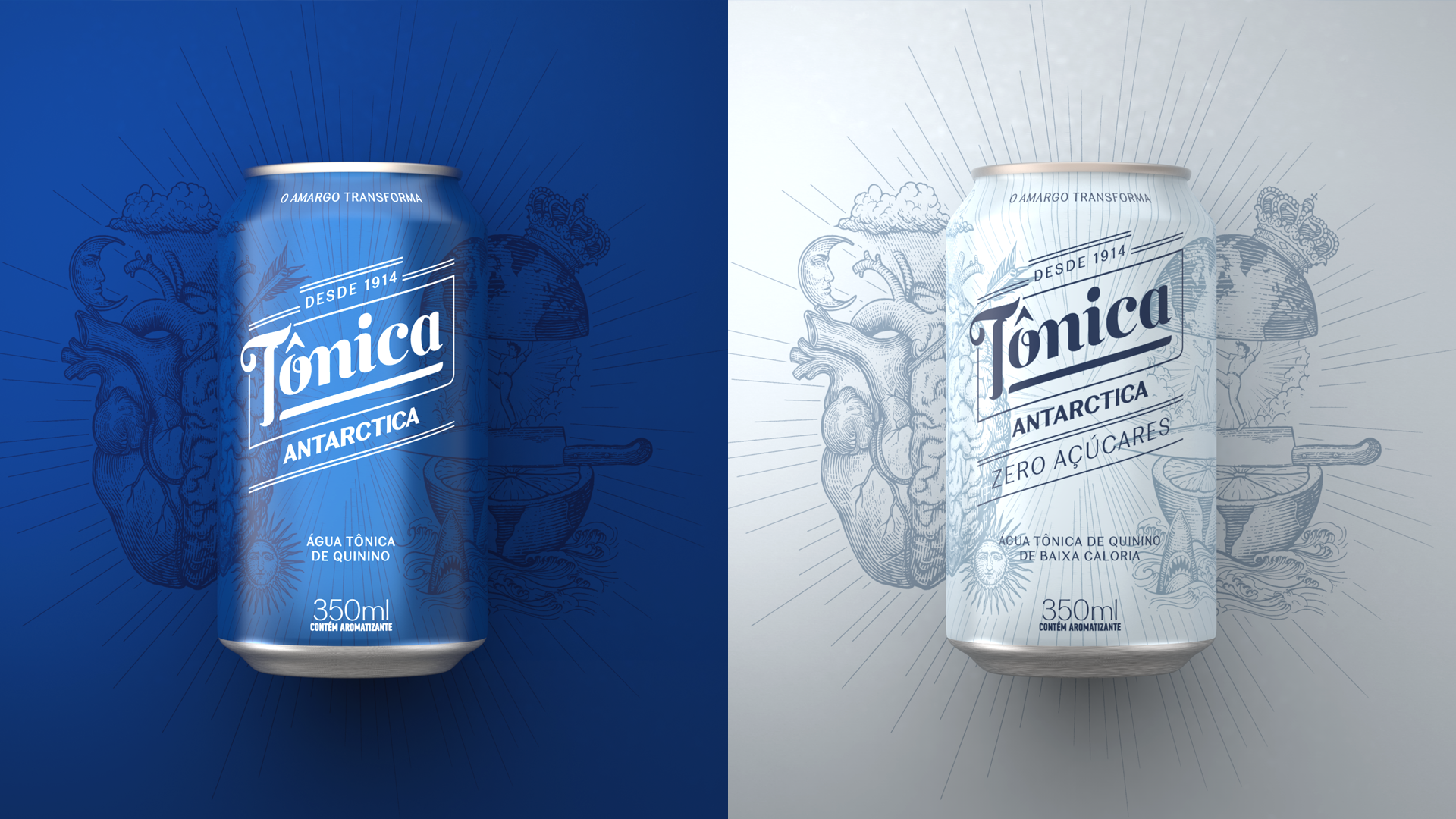
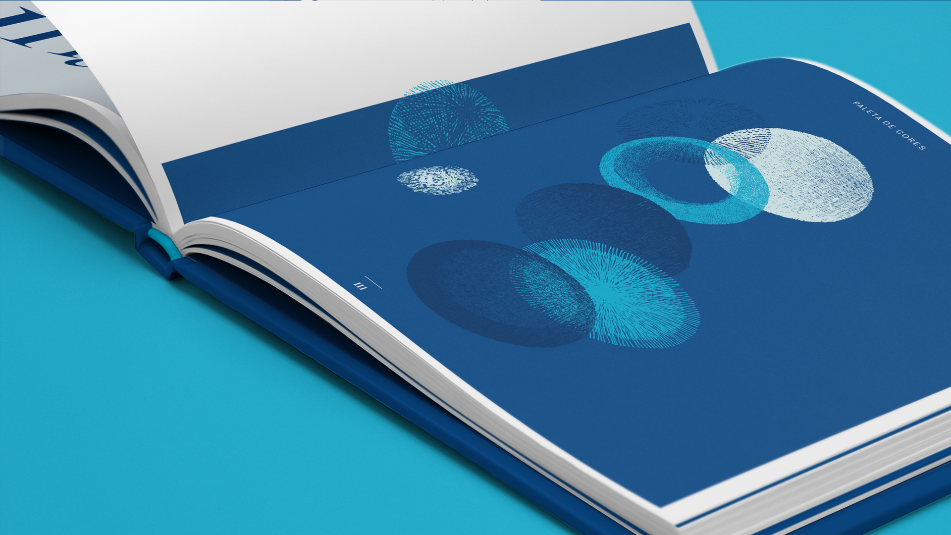
illustrations style
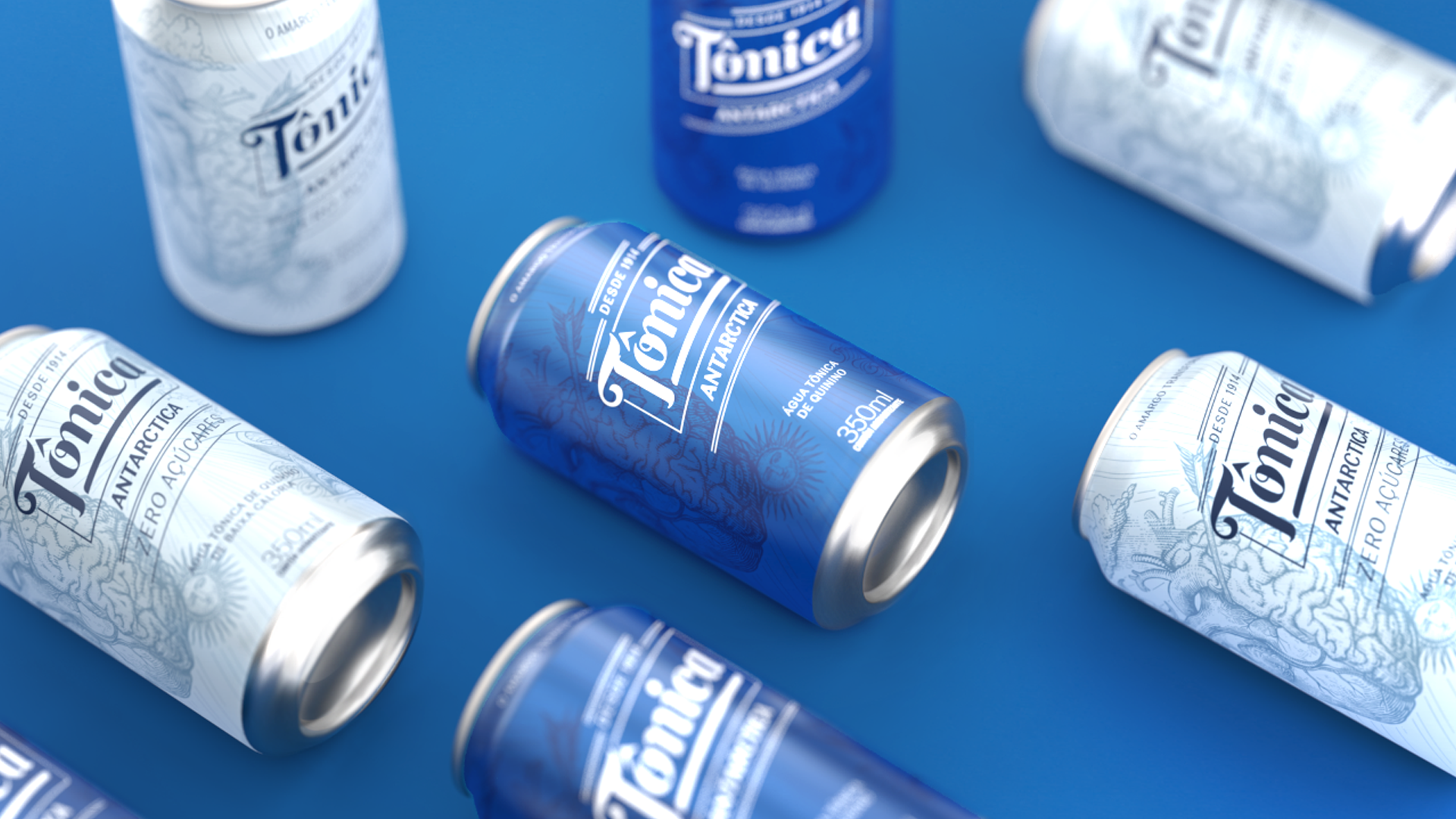
illustrations style is an invitation to transformation. represented by dreamlike, provocative and subjective designs, elements are used in duality to create association with popular expressions that portray the tensions of adult life, such as "riding on the razor's edge" and "between reason and emotion". the outline of the illustration refers to the classic style of old engravings where volume, light and shadow are represented by means of hatches with different densities.
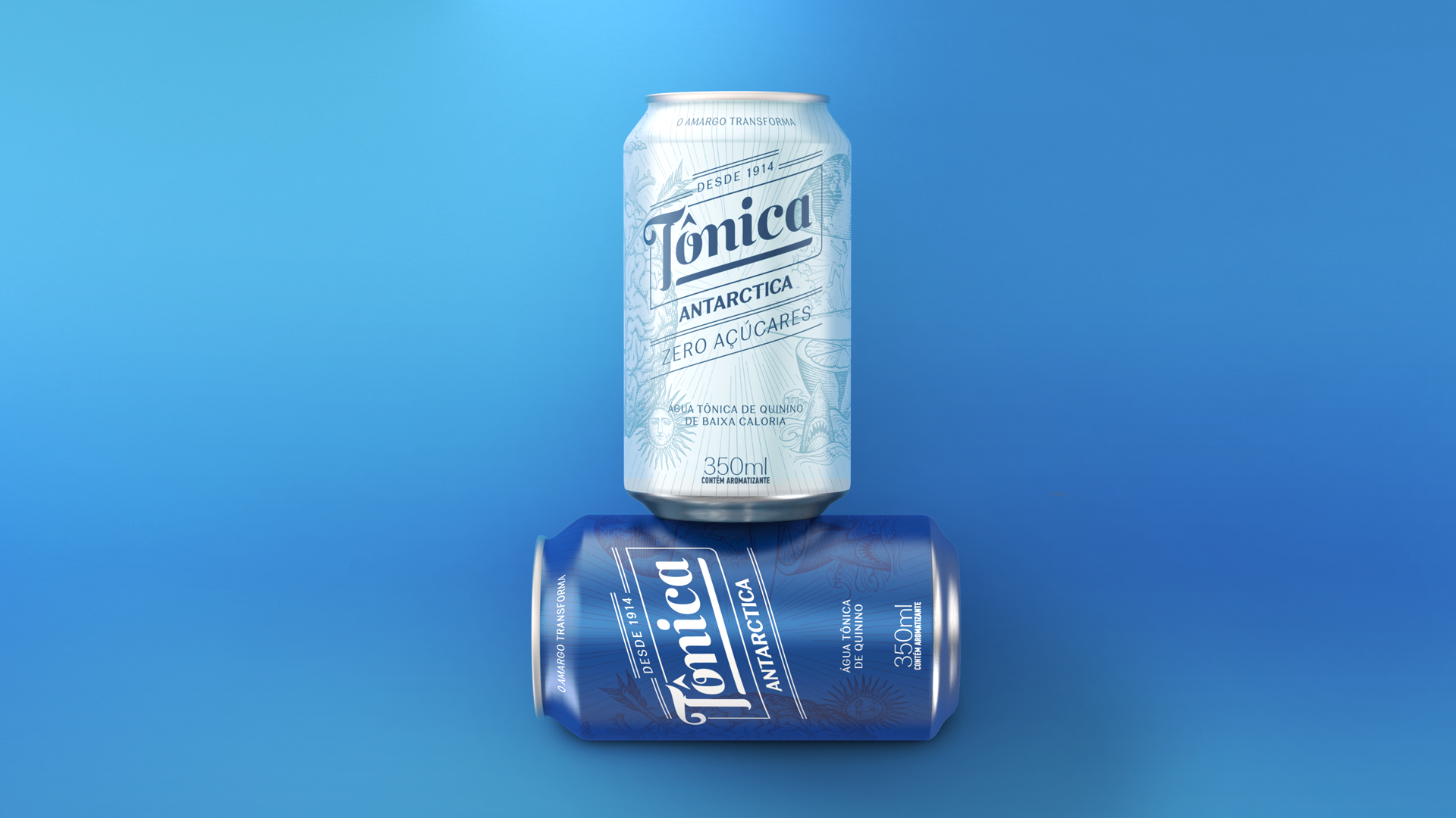
packaging
the combination of illustrations, logo and tagline give the brand new life in order to bring it closer to the young adult.
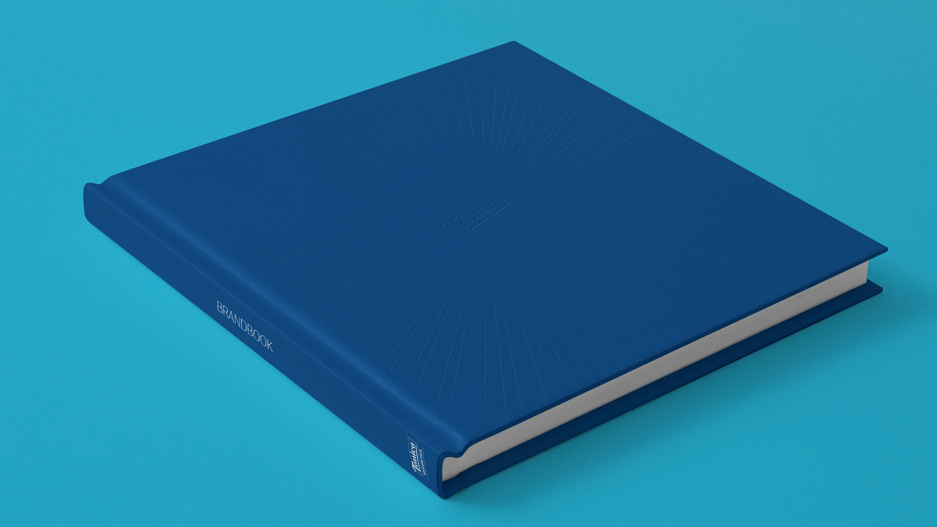
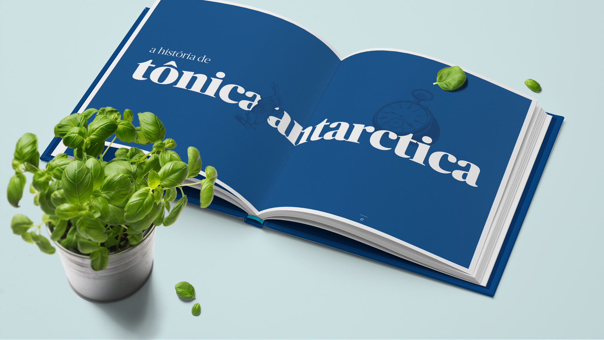
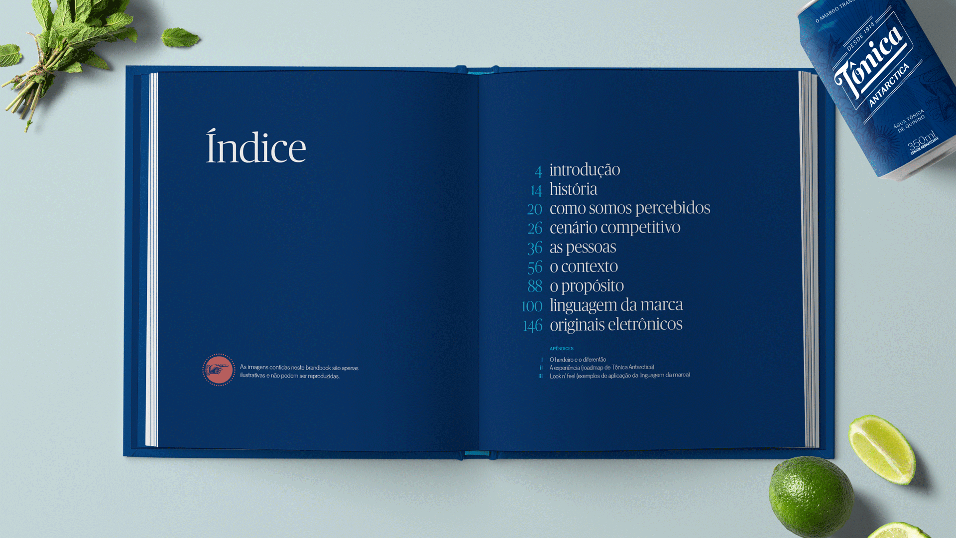
brandbook
more than a conventional brandbook, we’ve delivered an innovation roadmap that will support the next steps of brand management for the client and its partners, including activation, communication and brand experience guidelines.
↓
"tônica antarctica is a centenary brand that had never done anything in terms of branding and communication. the idea behind this renewal is to bring forth the brand's emotional appeal, getting closer to young adults again. questtonó is a very visionary and attentive company that worked with us during the whole process of rebranding, including the new visual identity and touchpoints."
isa aniceto
innovation manager on soft drinks
innovation manager on soft drinks
brand expressions
during the five months working with ambev’s innovation team we observed the brand in all its manifestations and proposed a solution based on systemic design. the strategy provided a ground for us to create a new visual identity, new packaging and product’s portfolio.