so.si
project developed via questtonó
with so.si, we went beyond thinking about a single product or brand. after several analysis and research, we designed a strategy deeply connected with contemporary brazilian women’s aspirations. this assisted us in delivering something bigger: a new business concept that synthesizes totally different ways of thinking about production, buying experience and shoe usage.
research
in order to develop our first pair of shoes, we closely investigated how the female audience relates to shoes: when in window displays, in their own wardrobes and in their feet. we conducted interviews and closely followed shoppers while browsing through different stores.
with this data we uncovered that women wish to go through their days with independence and effortlessness. with a busy lifestyle, they want their shoes to transmit personality and beauty without losing comfort. with juxtaposing insights, we knew that our solution would have to encompass the diversity of shapes and tastes of the brazilian women.
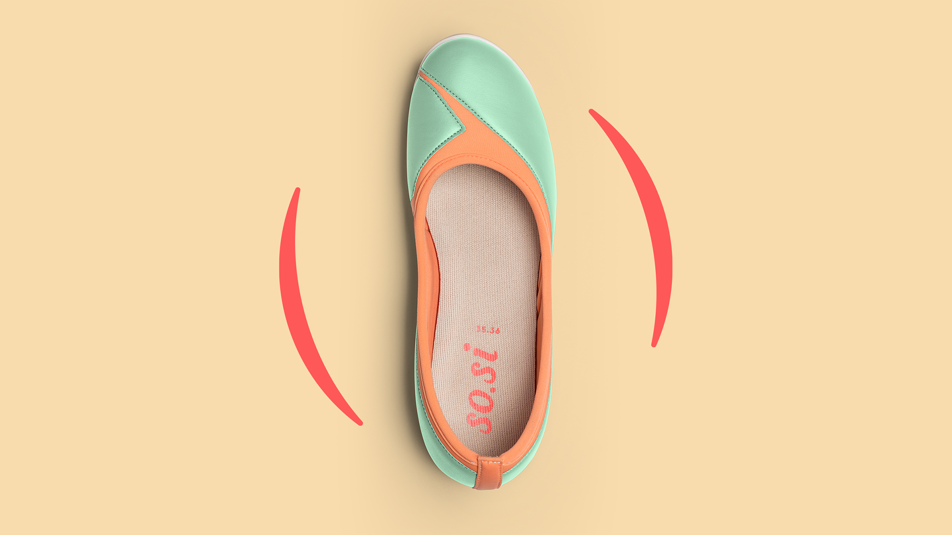
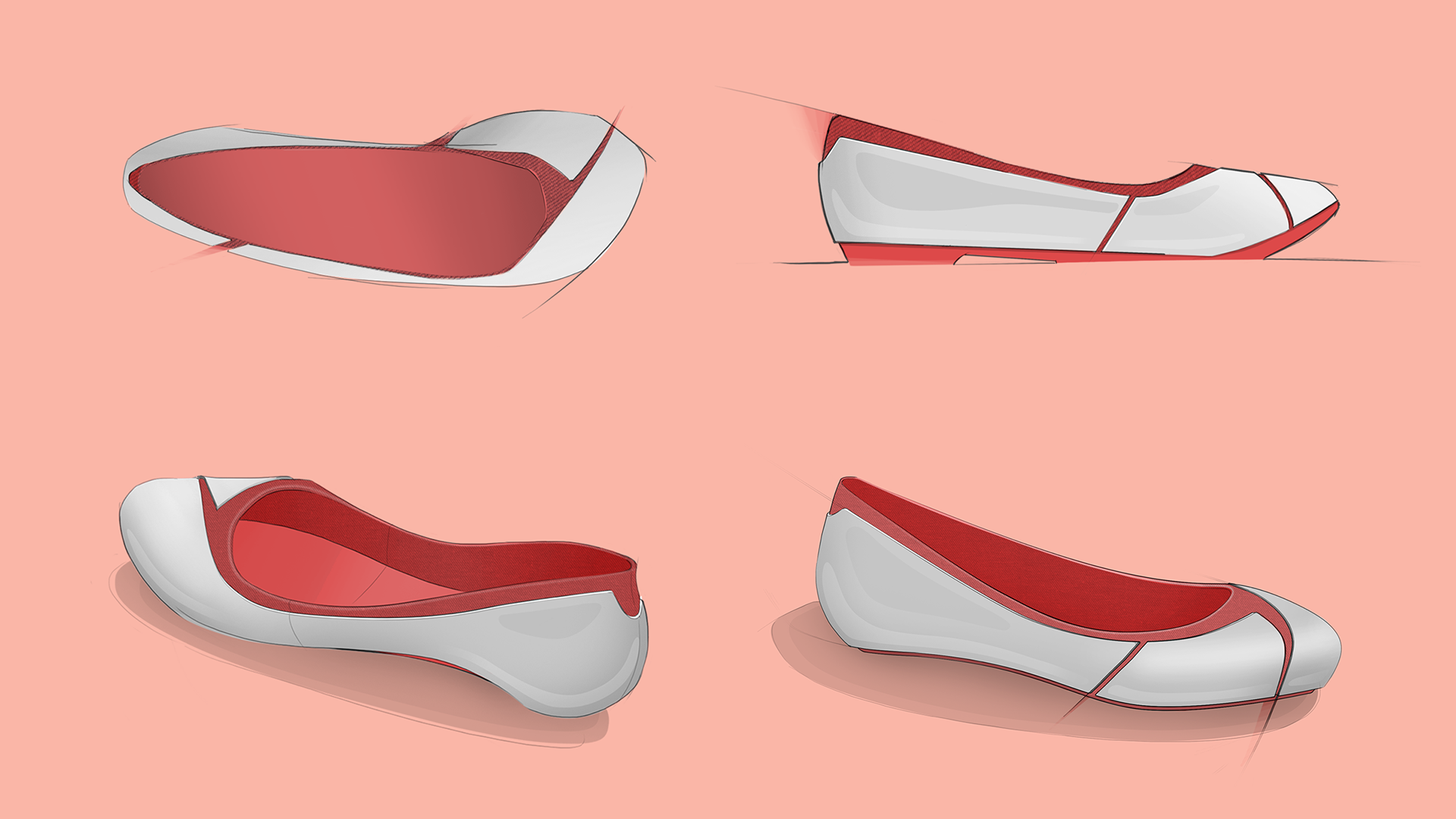
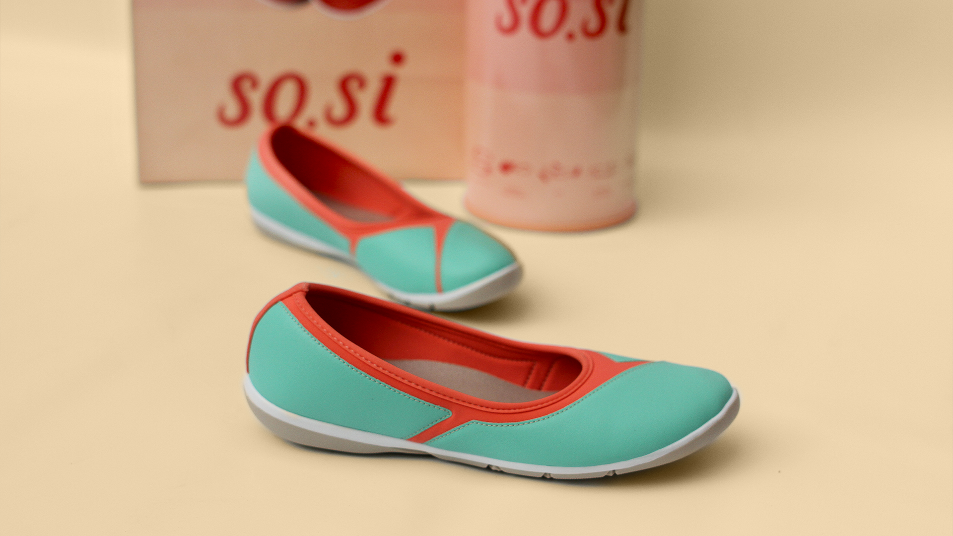
adjustable shoe
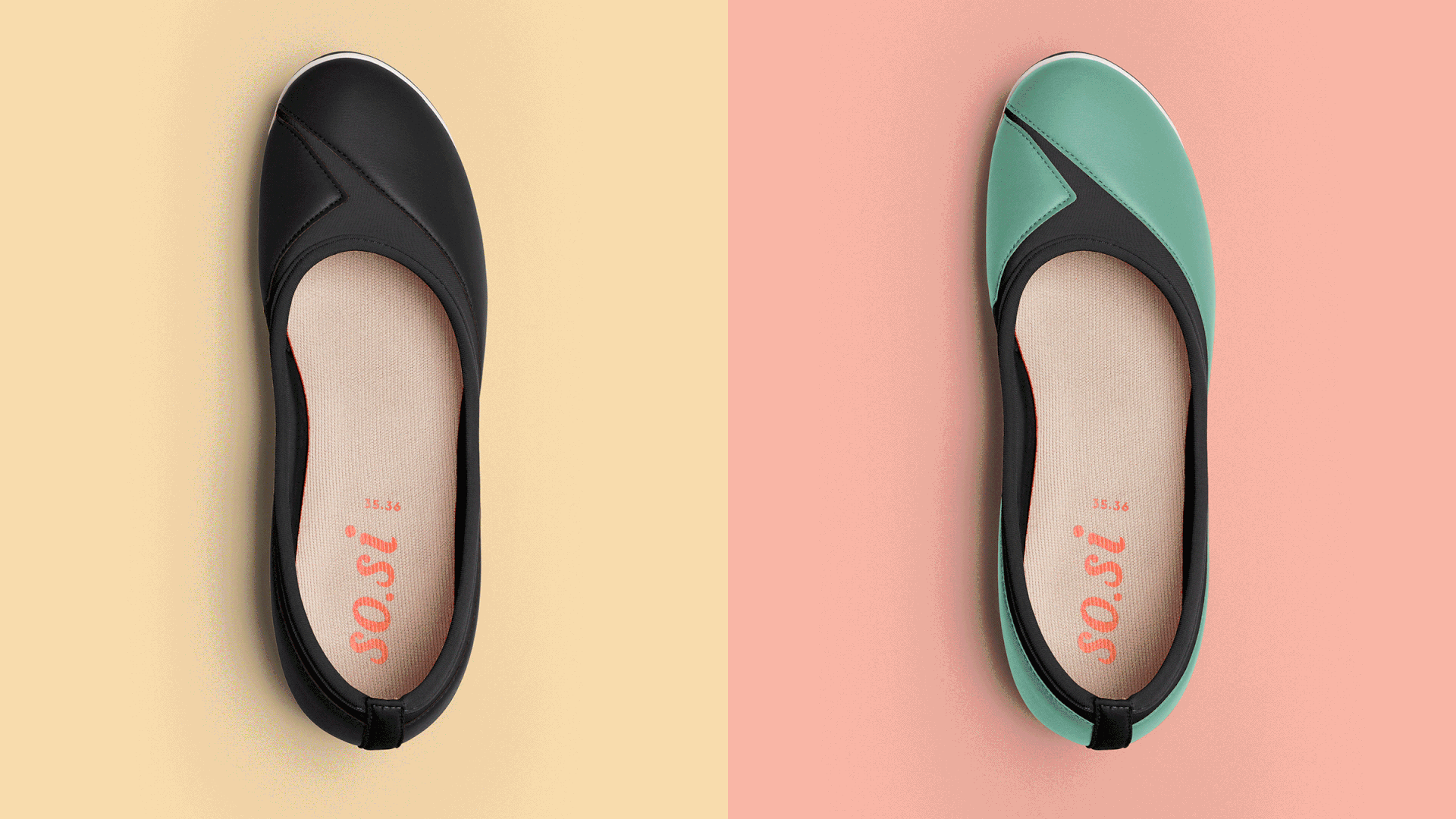
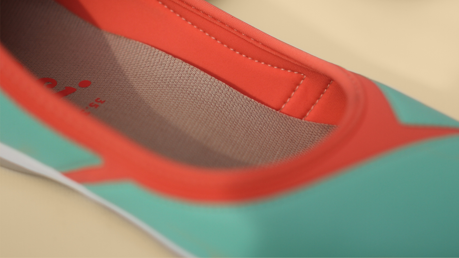
amongst 20 different products we brainstormed for this project, the idea of an adjustable width/height pair of shoes stood out. it would be able to fit all women’s shoe sizes. to make it possible, we developed a shoe that combines elastic materials with more rigid ones for the sole area.
this composition is built in a geometric segmented structure, delivering a dynamic adjustment as soon as the shoes are worn. it not only increases the level of comfort but also reduces need for various sizes. it also reduces by 50% the amount of shoe moulds, optimising the production line and improving industrial productivity.
a new brand
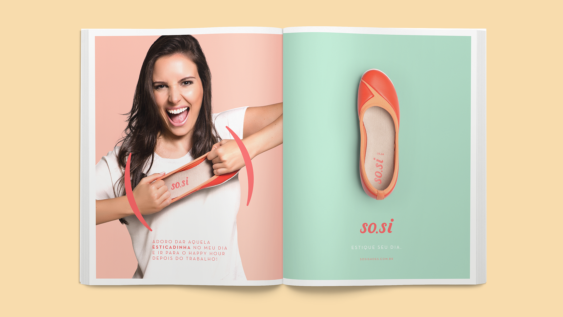
the strategy developed to create the shoes also empowered us to create all the branding strategy behind the shoes. the name choice - so.si, a reference to the word ‘sociable’ – was the first step in associating this new brand to the urban, plural and dynamic environment of the country. its versatility offers design with effortlessness and a laid back approach.
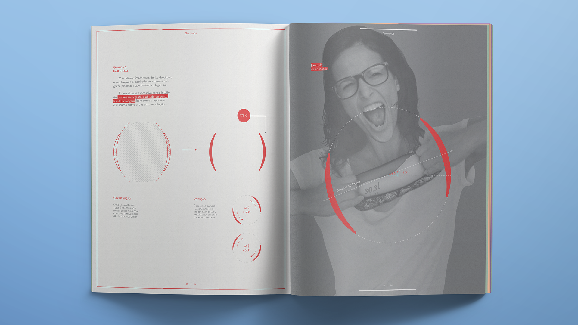
logo
the logo was created inspired by the pleasant sensory experience ensured by so.si. its light and friendly stroke is derived from brush calligraphy, and values the relaxed quality of the brand: a simple gesture, an uncomplicated solution without virtuosity or excesses.
the angulation of the characters resembles the constant movement of the busy and agitated life of the contemporary woman, while its rounded ends adapt to every curve with harmony and sophistication. the dot is the connection between the name’s syllablesand also the element that connects the different moments of a day in urban life with its different possibilities.
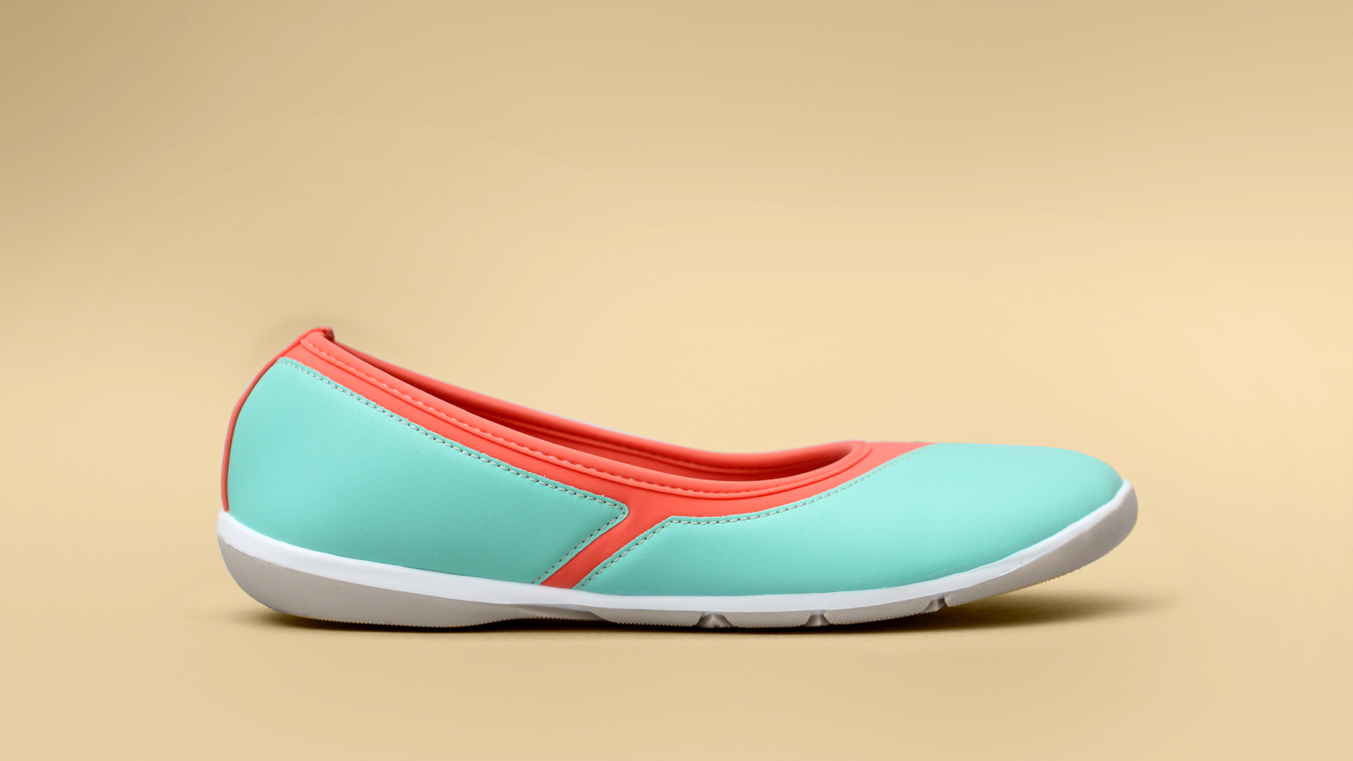
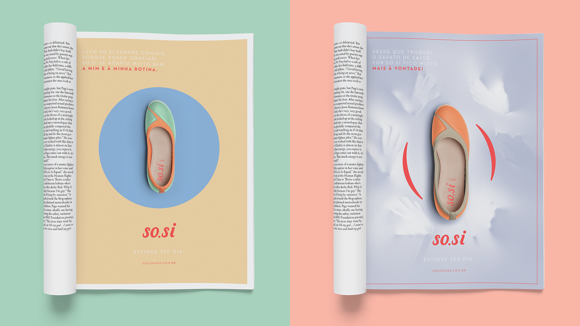
all this dressed in coral, intense energy source to supply the most active everyday, reinvigorating confidence to reach the end of the day well and ready for the next.
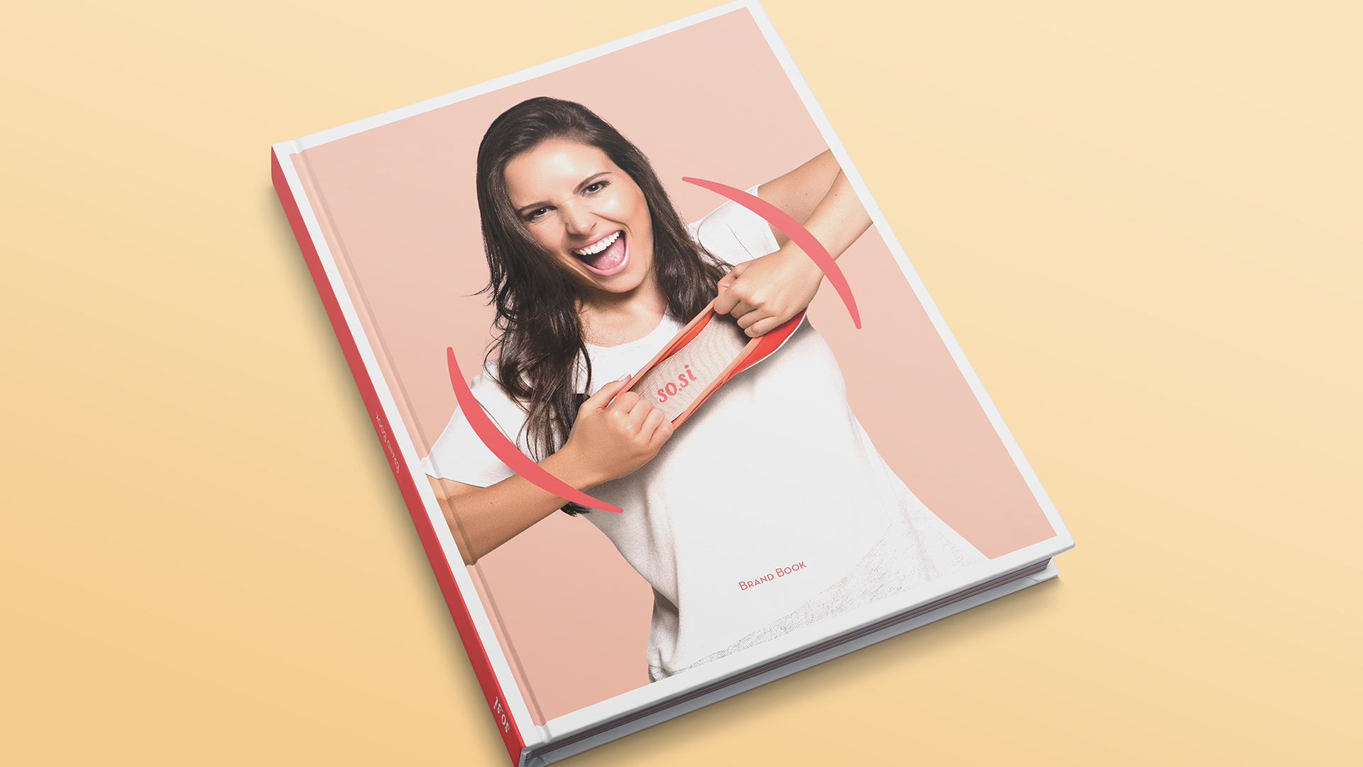
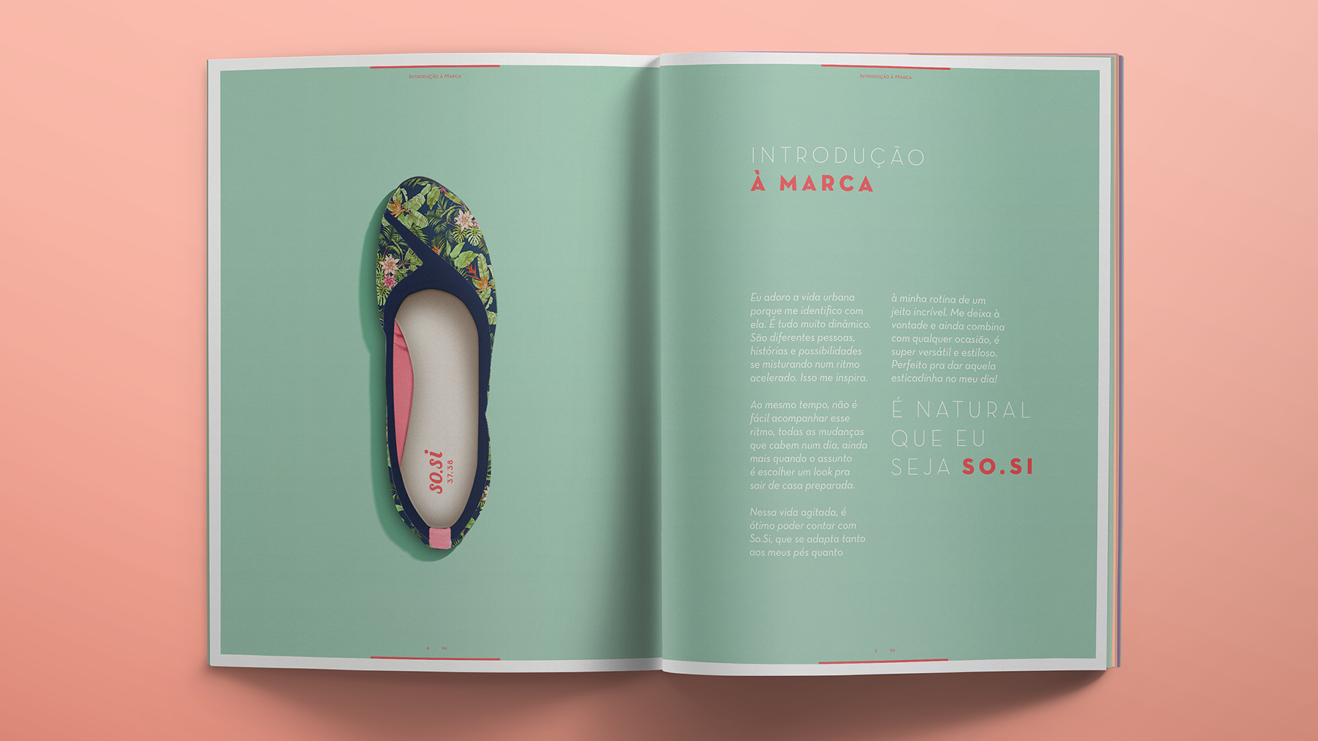
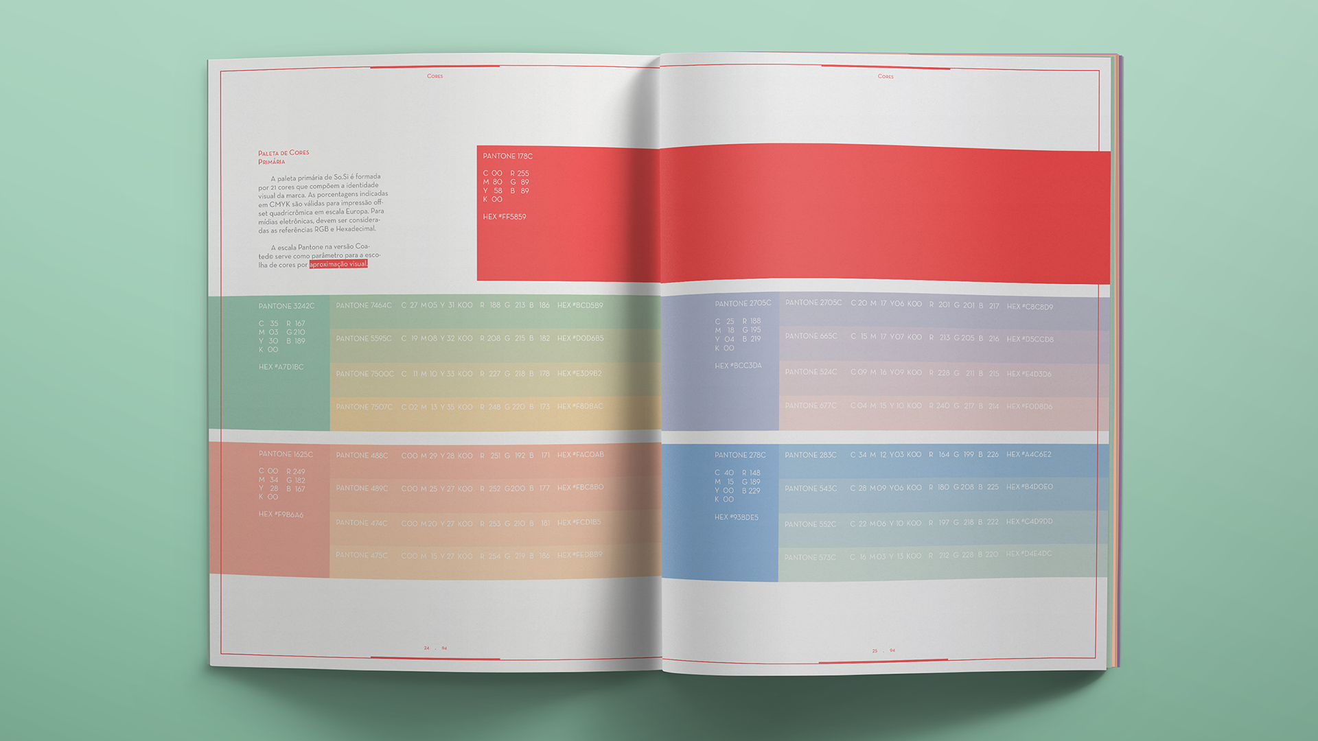
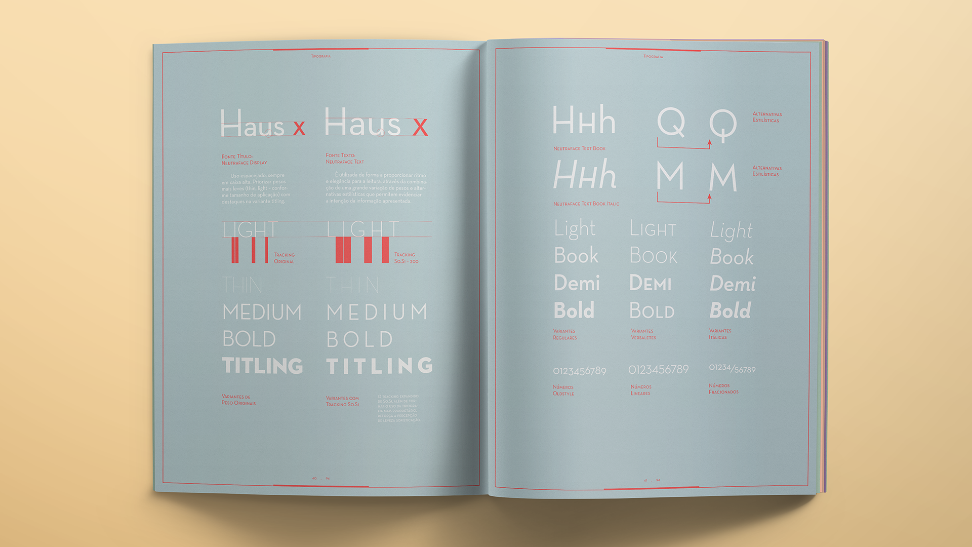
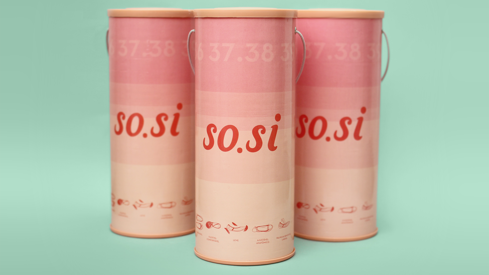
brandbook
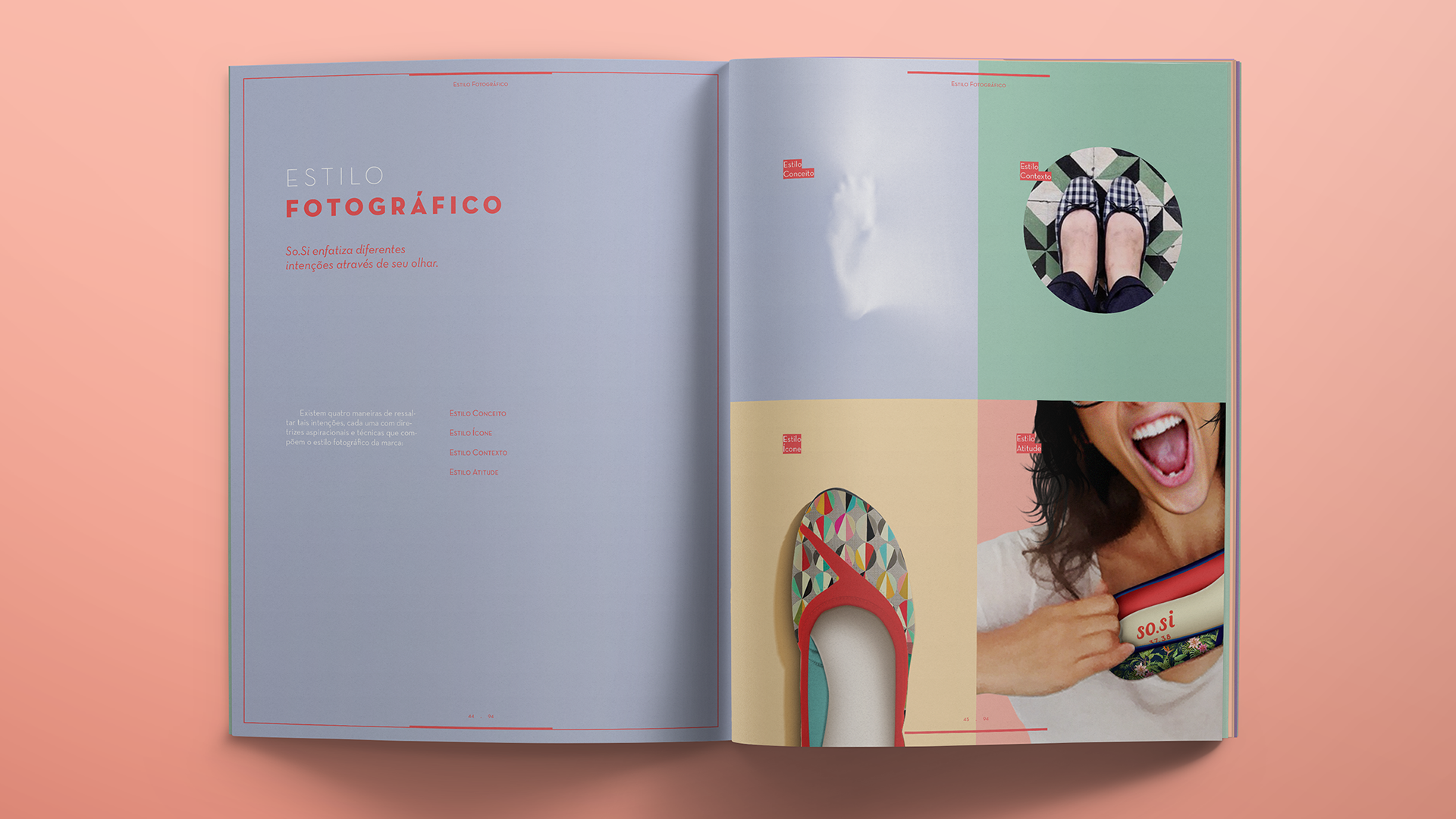
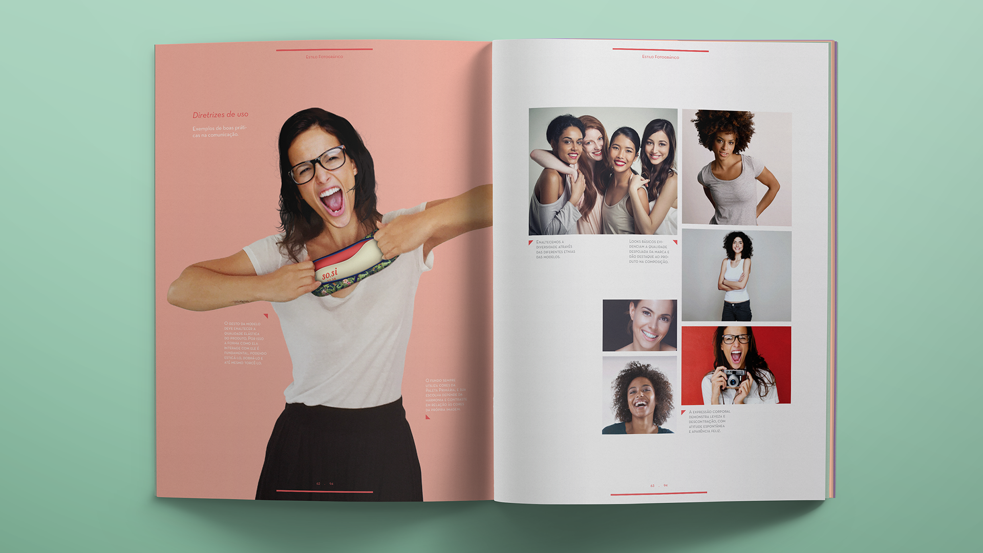
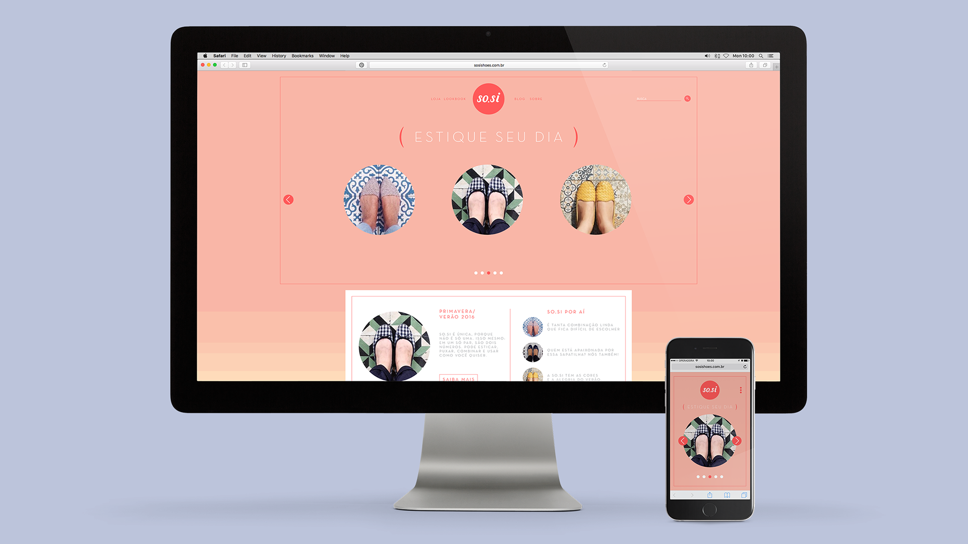
we wanted to bring easiness to all brand expressions – such as name, the gestural logo, the colour palette in pastel hues – and compile them on a brand book with guidelines and inspirations in order to steer all variations and possible developments of this new aesthetics, including from typographic usage to the photographic style and speech tone to its communication.

a new shoes platform
we have created a new shoes platform that, in addition to allowing size adjustments for comfort, optimizes numbering grid and communicates emotion through its brand and style.
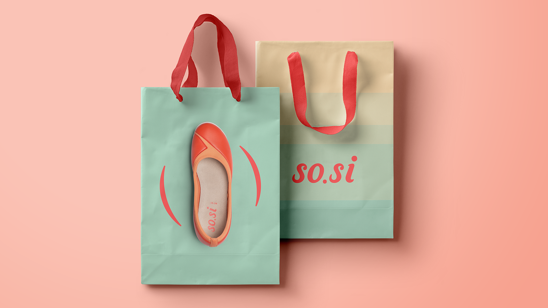
brand expressions
the brand must show the same lightness and casualness in its language not only through the footwear and logo, but also by other means of expression such as packaging, advertisements, websites and any other touch point, supported by a value proposition that reflects all what this new experience represents.
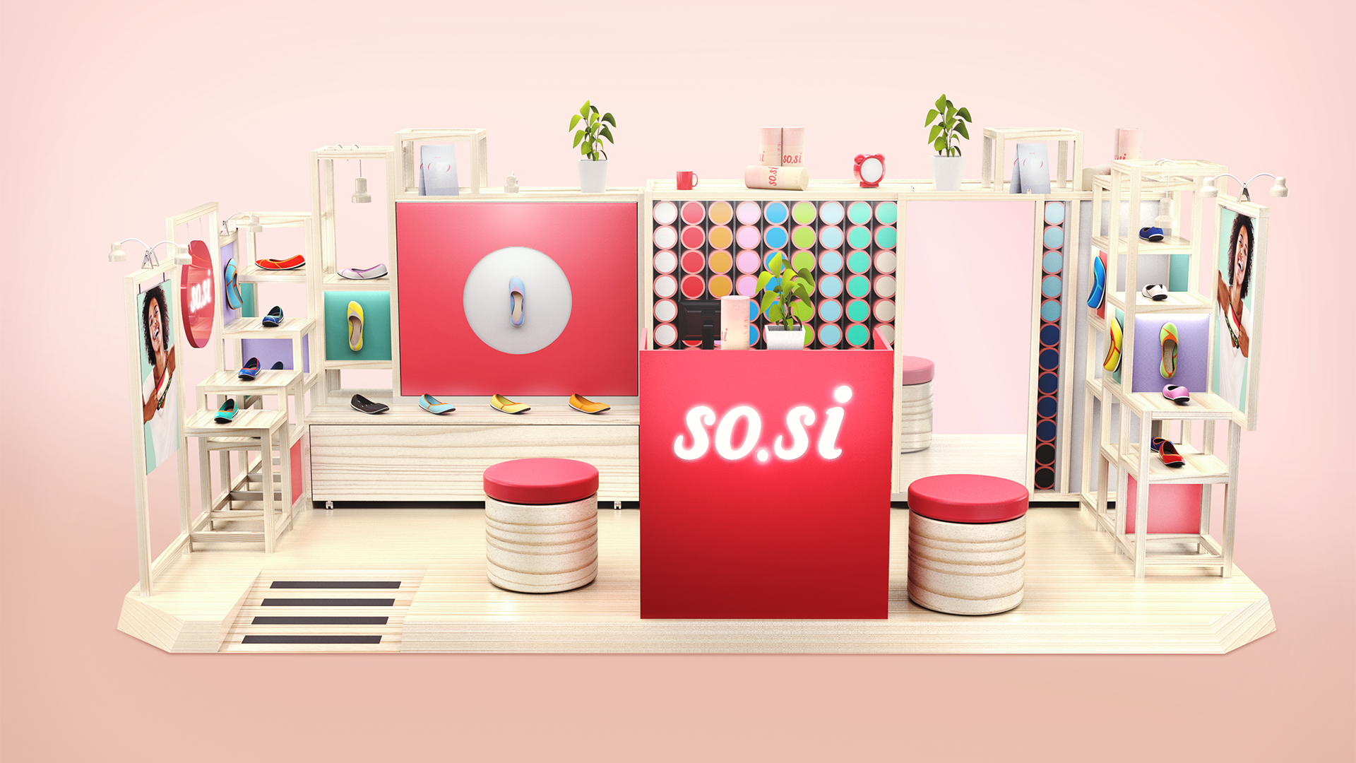
point of sale
we designed the pos following the guidelines of the brand book, and its implementation was the final step of this project. we had all our teams – research, strategy, product and graphic design – involved in this and so.si is the office’s first all-team delivered project.