keo architects
project developed via reverb
an architecture studio was looking for a visual identity. among its advantages is the use of prefabricated structures in projects of great impact – a sustainable option, but still challenging in the perception of the constructions market in brazil.
ability to act in the face of changes
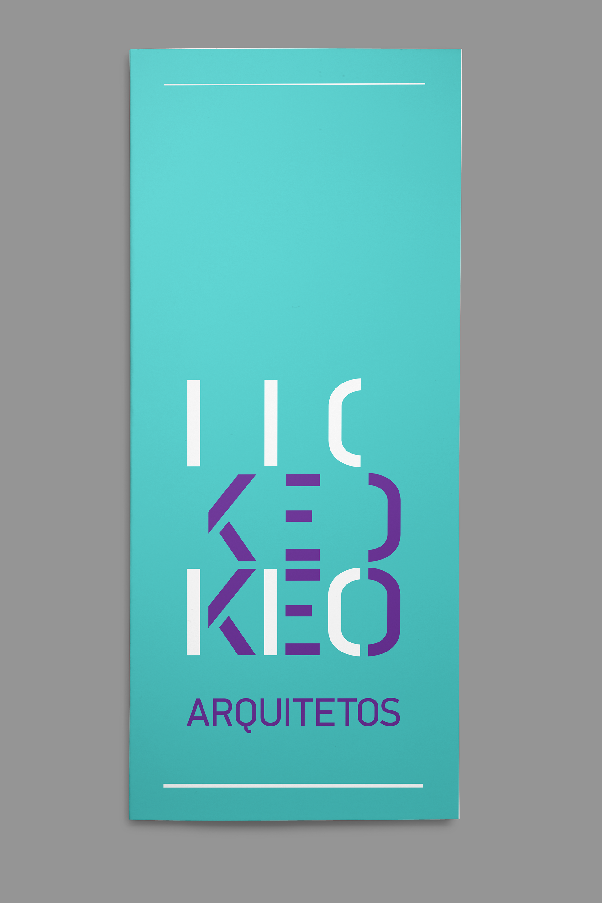
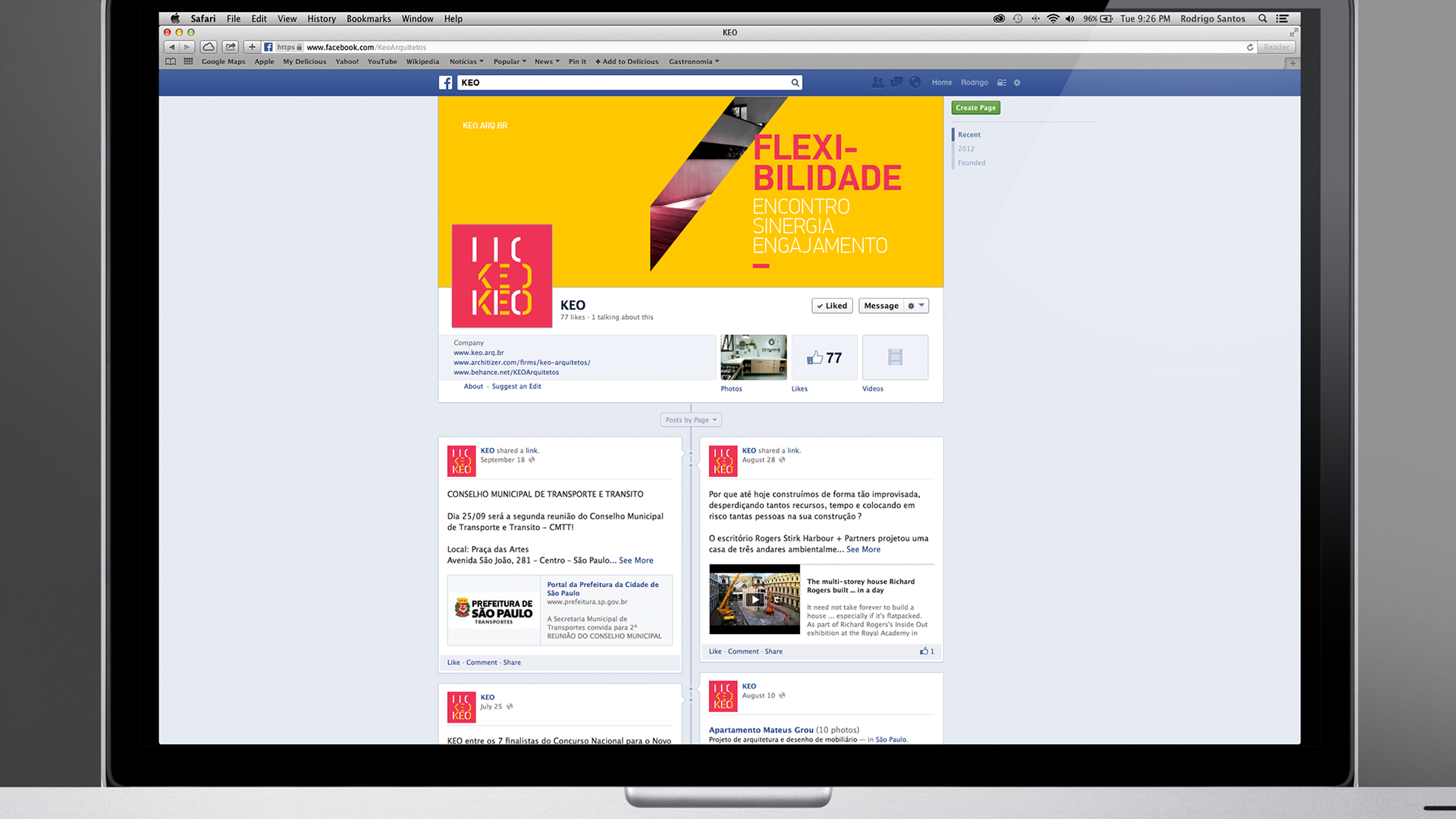
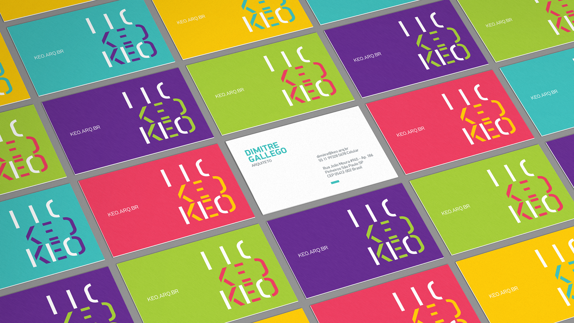
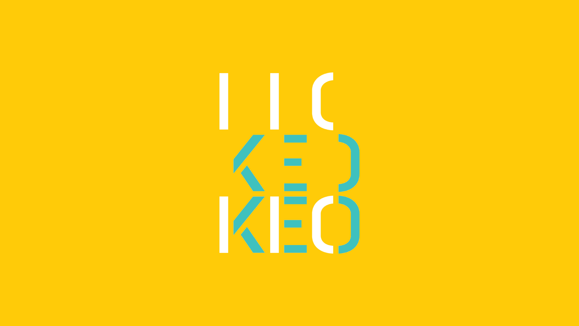
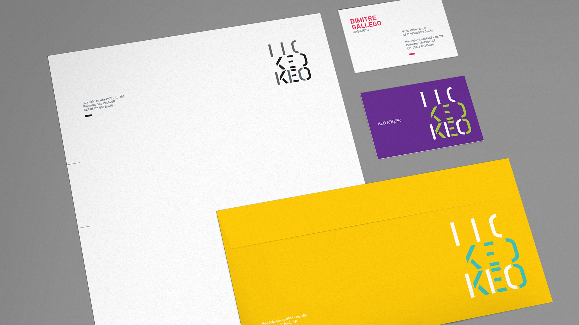
we started from scratch, defining its positioning, visual guidelines and its name - keo, chosen after an intensive process, is an evolution of "queo", a latin word meaning "ability to act". the logo relates to buildings scattered through elements that unite, referring to a harmonic sense of movement.
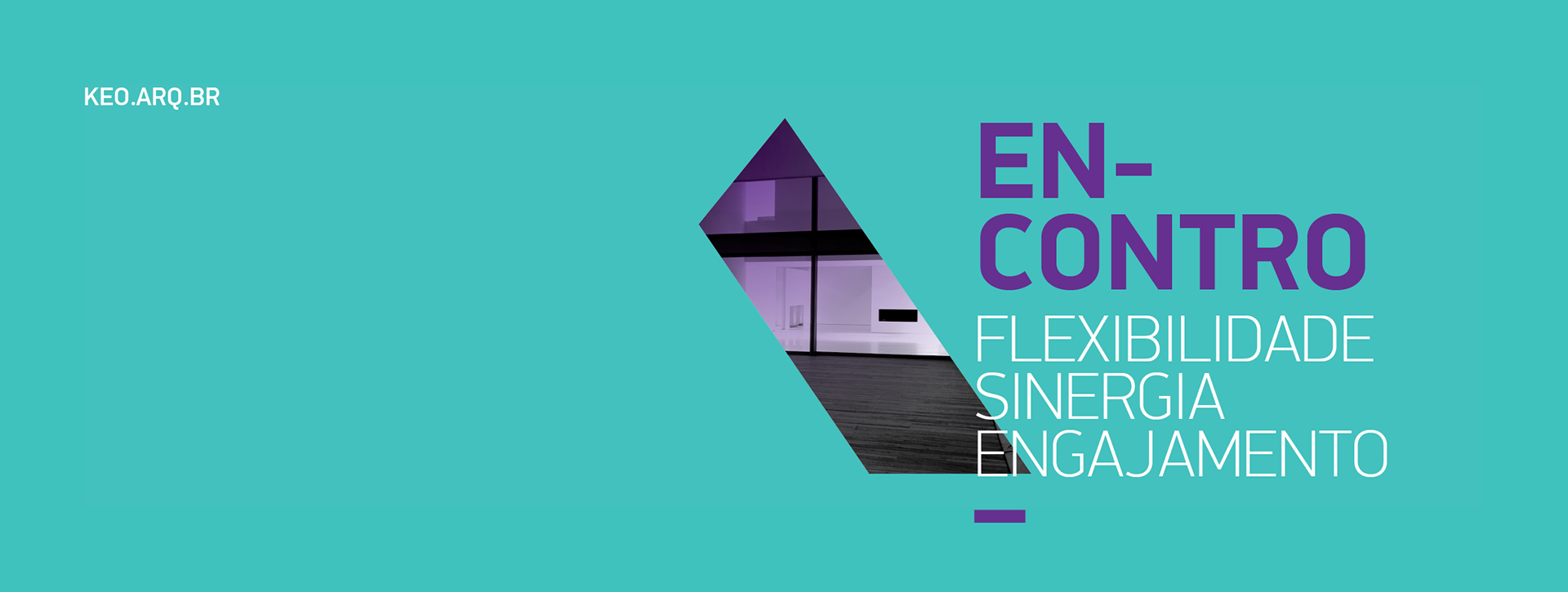
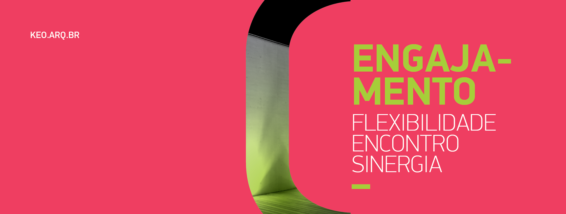
pieces made to fit
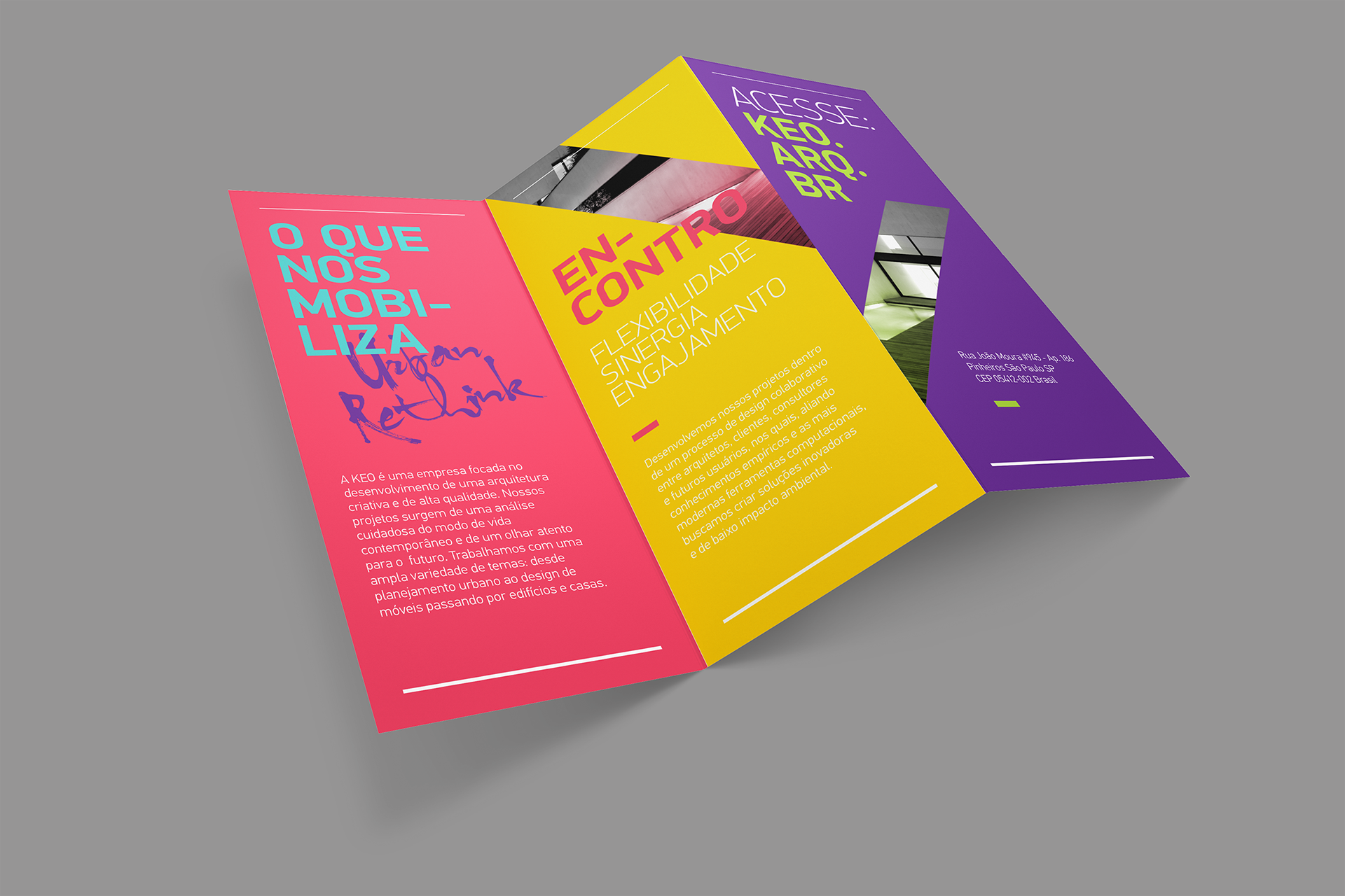
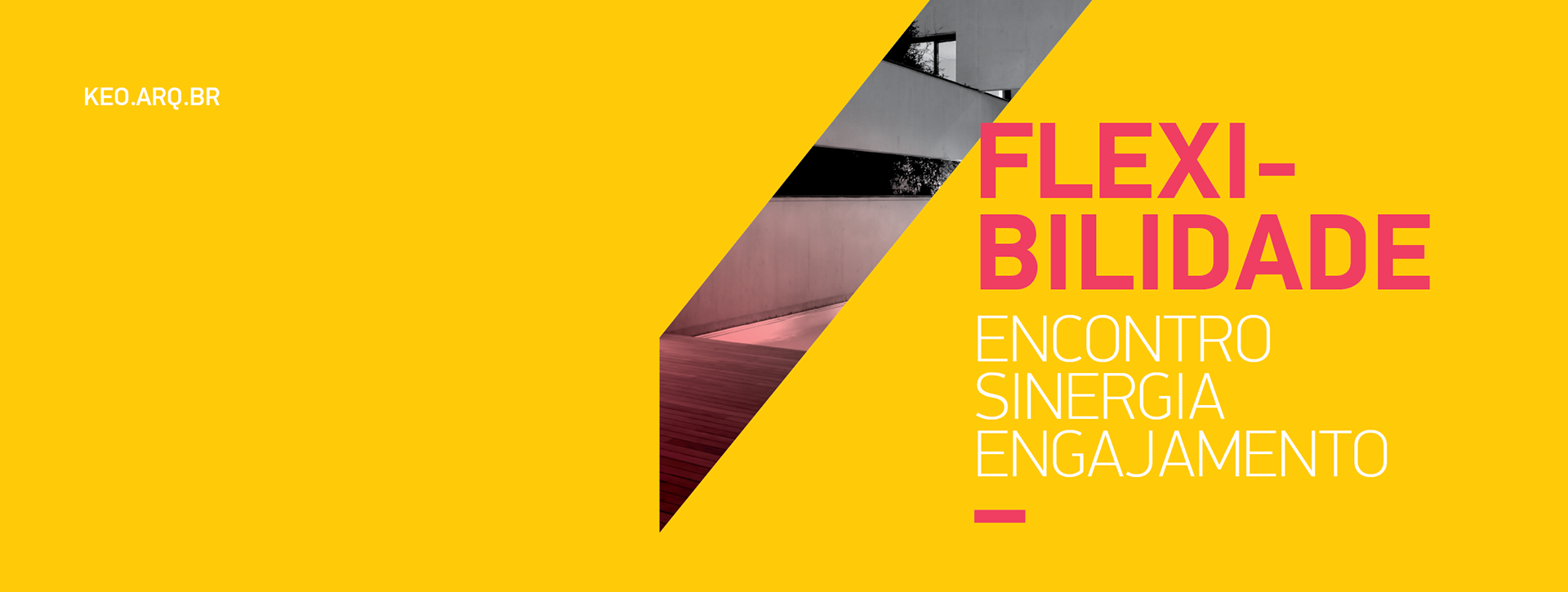
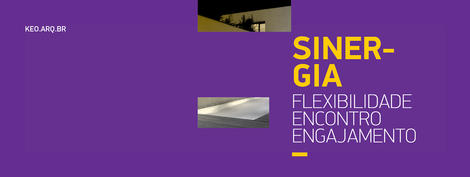
the parts of the lettering that make up the logo become graphic elements used as windows that help to perceive details of the architectural spaces while providing the same harmonic sense of movement for the layouts executed for the brand.