du cabral gastronomia
project developed via reverb
the gastronomic consultant du cabral sought an identity to translate his strong personality and his passion for cooking.
visual identity
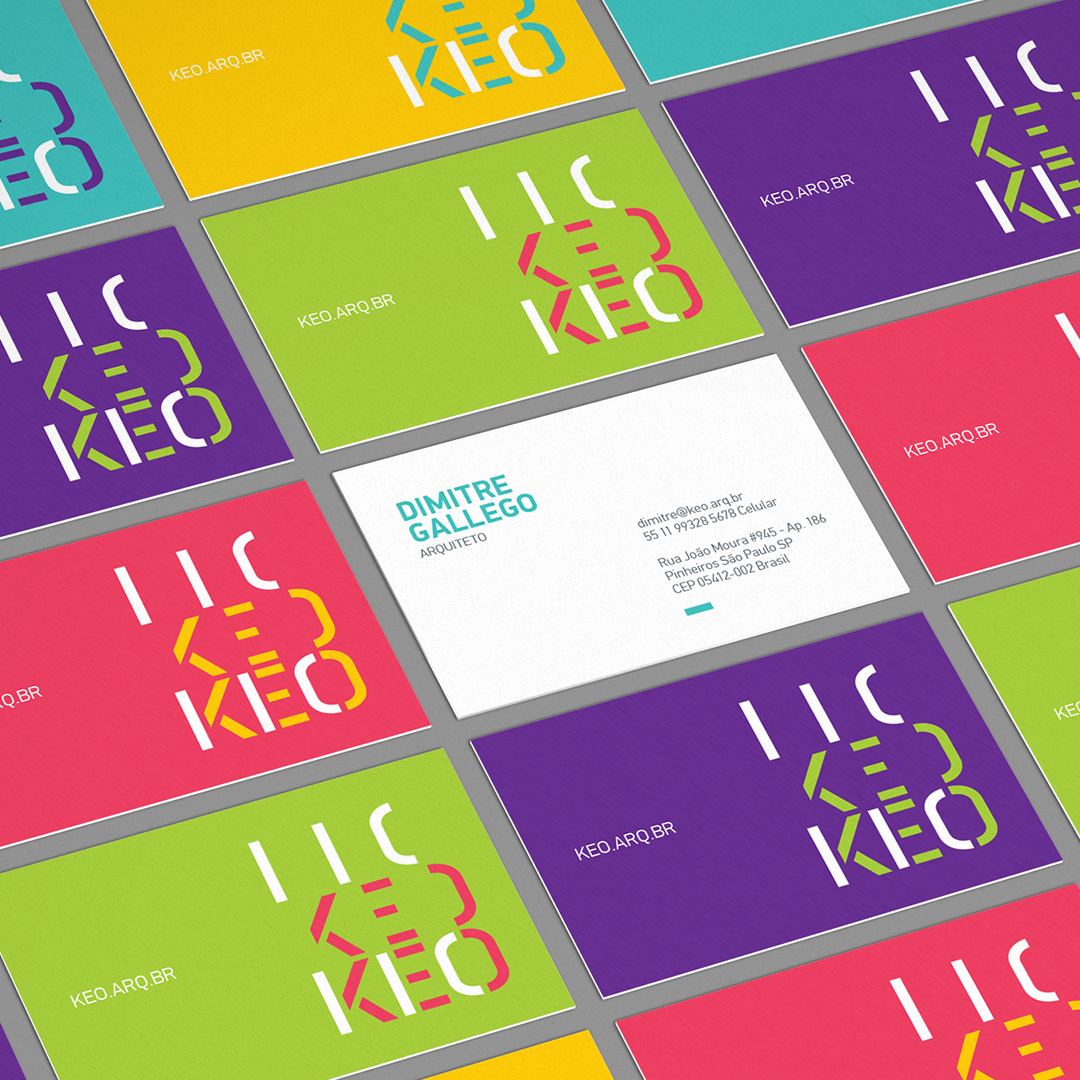
we developed a visual universe and an unique typography that combine the rustic character of du cabral’s cuisine with his contemporary profile and stripped-down style.
45º angle is key
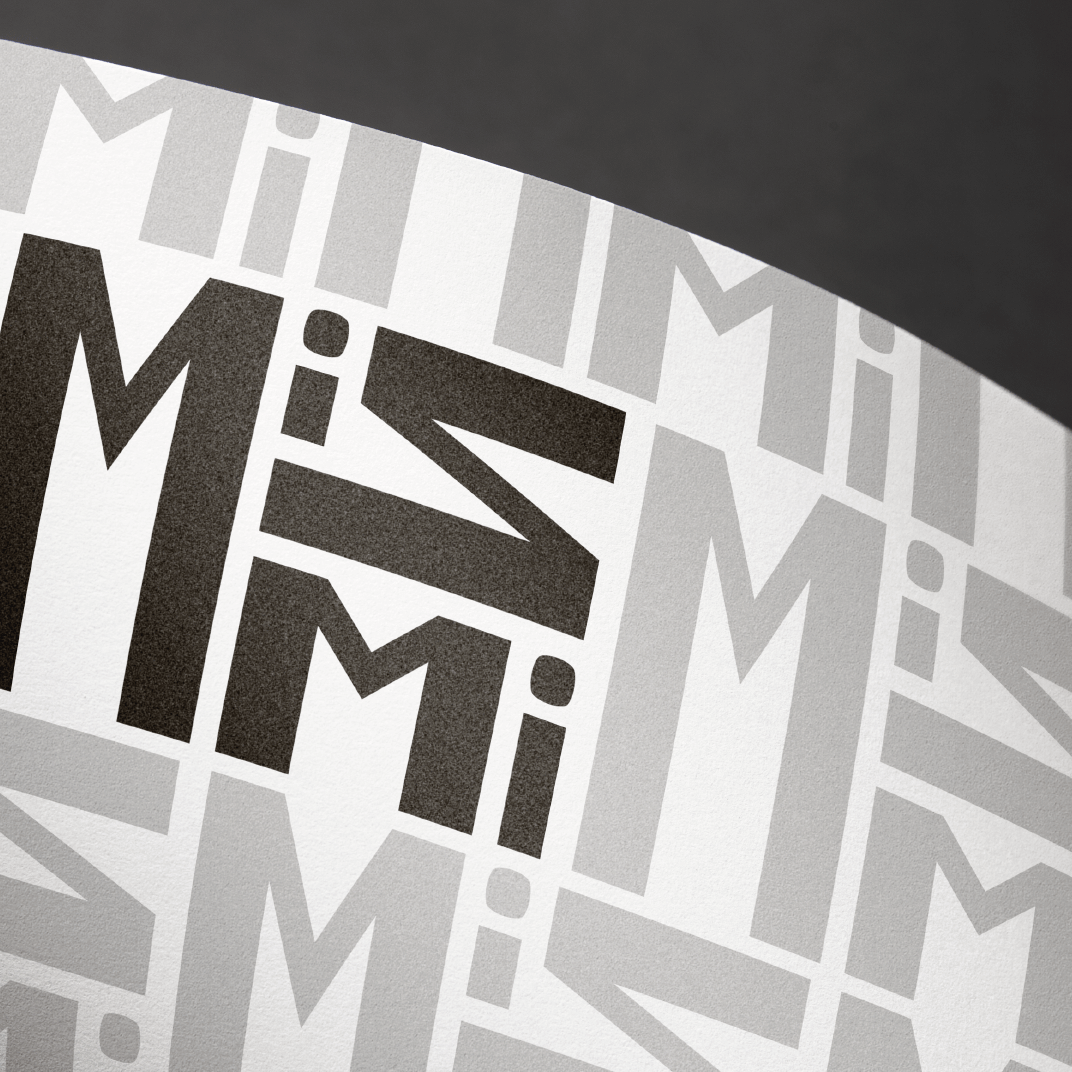
the symbol unfolds in graphic elements organized at a 45 degree angle, which allows the formation of patterns as well as cuts in the composition to separate information and provide a sharp look.
unique typeface
the typography was conceived and designed using a grid to reinforce the perception of precision in the cut that only a kitchen knife in the hands of an experienced chef can have.
