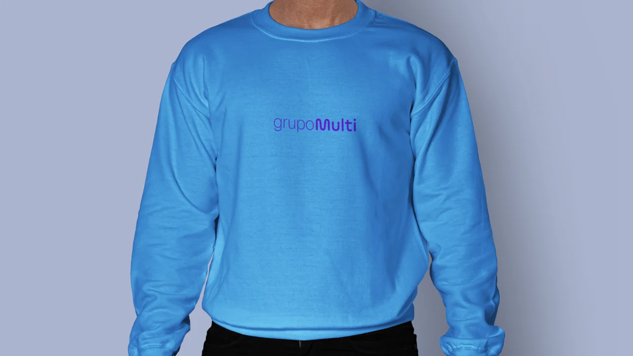
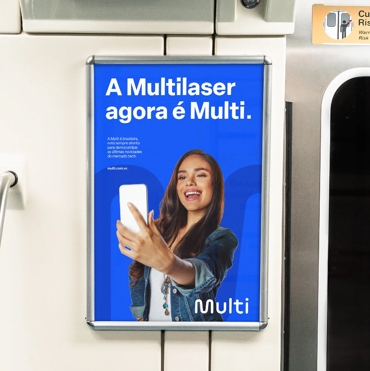
multilaser's growth had brought thousands of products and a broad collection of owned and licensed brands under one name. the challenge was to clarify this portfolio, support future acquisitions and distinguish the company from the products it sold. a new brand architecture established grupo multi as the corporate brand and multi as the technology brand, united by the idea of making technology accessible to everyone.
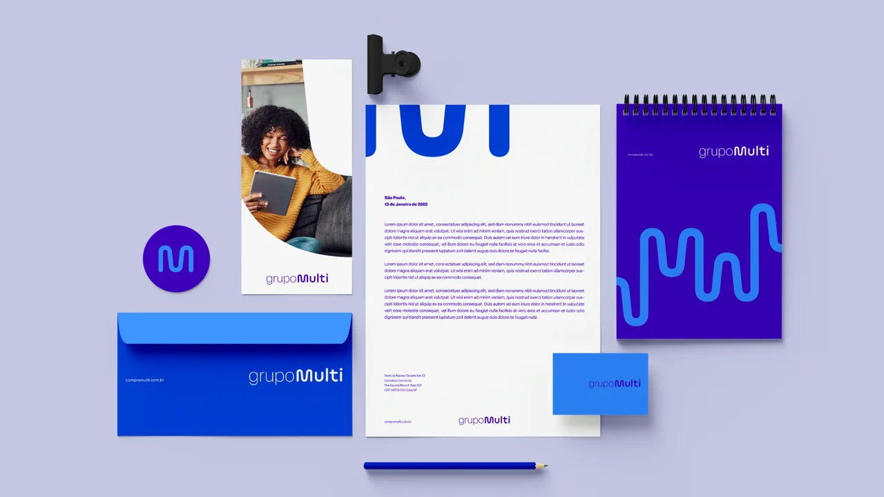
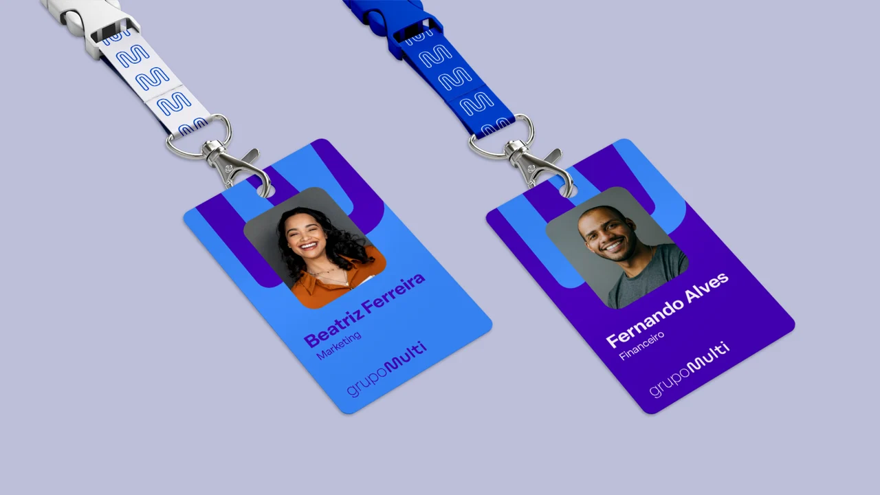
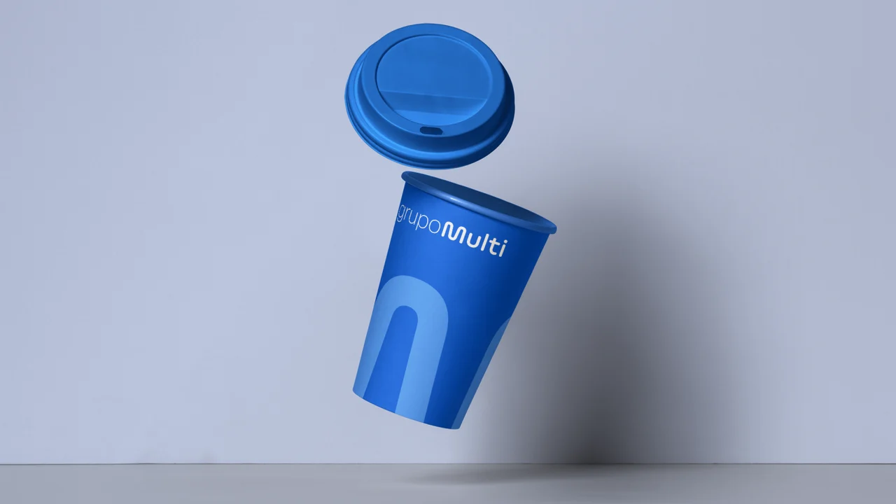
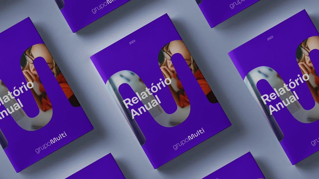
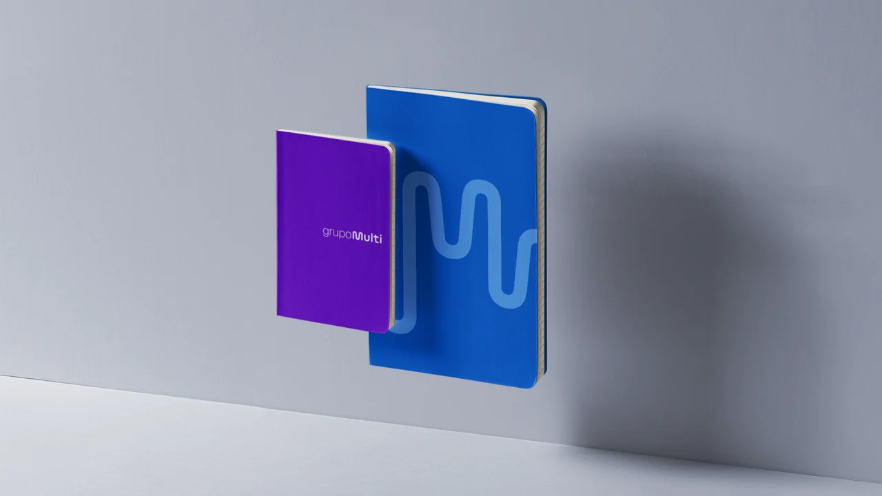
the simplified name and a shared "m" connect the two identities, while colour and expression distinguish their roles. a restrained corporate palette sits alongside a more vibrant product language, with rounded typography and accessible communication. flexible graphics and packaging organised by category bring the architecture into everyday use, helping people recognise products and navigate the portfolio.












 rodrigo santos