helbor's repositioning began with research into its internal culture, clients' perceptions and the property market. the central idea was to transform spaces into welcoming places where people feel at home. this purpose extends beyond individual developments to their surroundings, connecting the company's family heritage with its contribution to neighbourhoods and city life. the identity needed to express both this warmth and the sophistication of its properties.
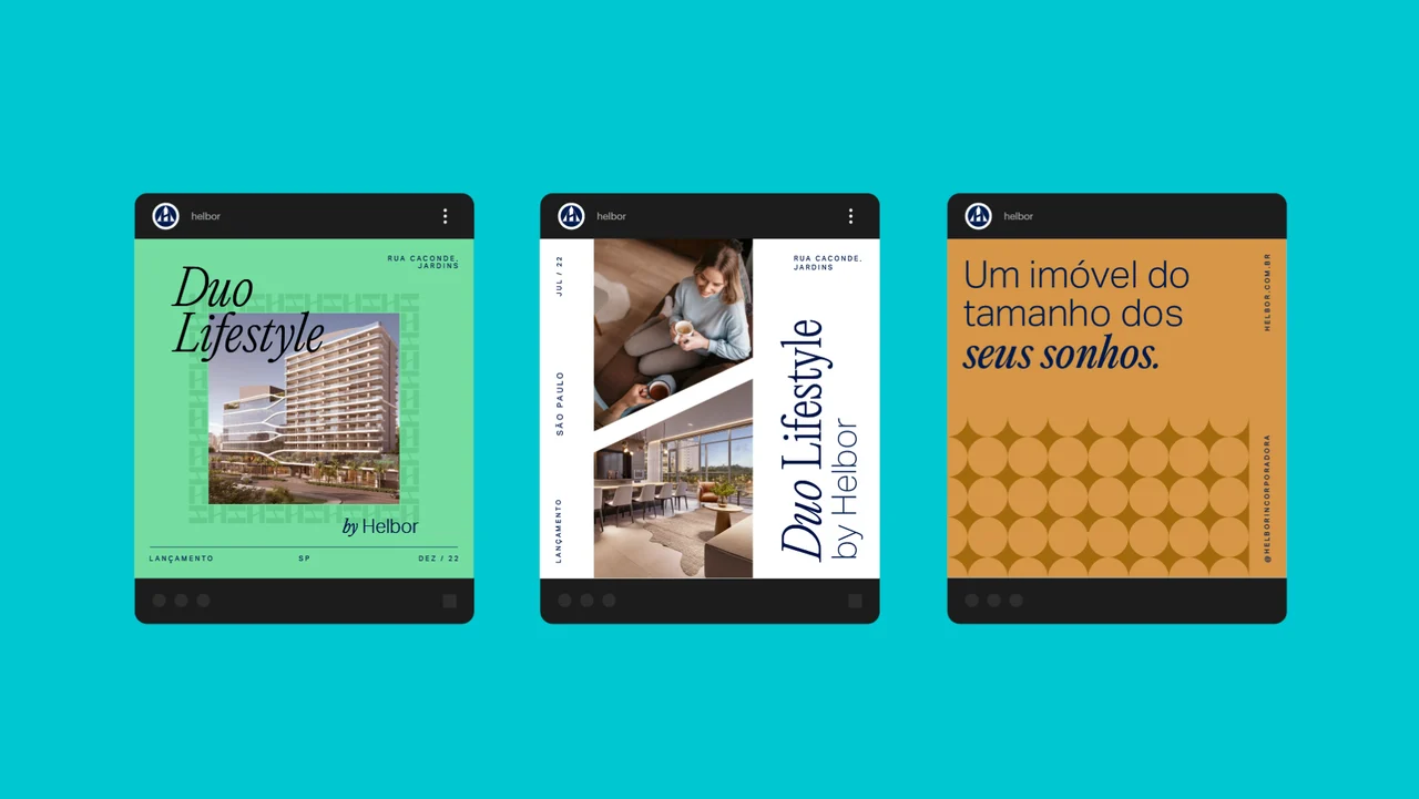
the visual language draws on luxury and fashion, combining monogram patterns, serif typography and restrained editorial layouts. refinements to the logo bring its symbol and lettering closer together, while a brighter blue and gold accents renew the palette. the system pairs a sense of familiarity with a contemporary presentation across the brand's communications.




 rodrigo santos