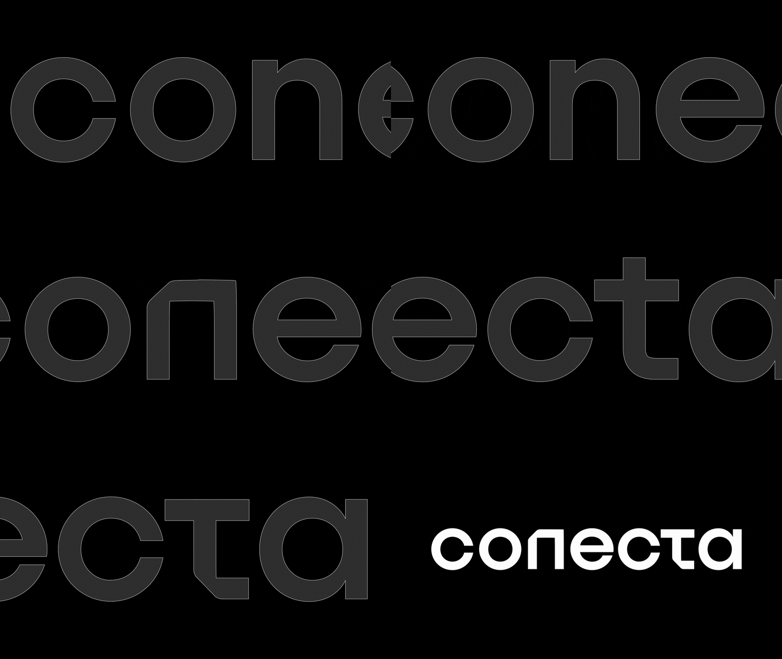
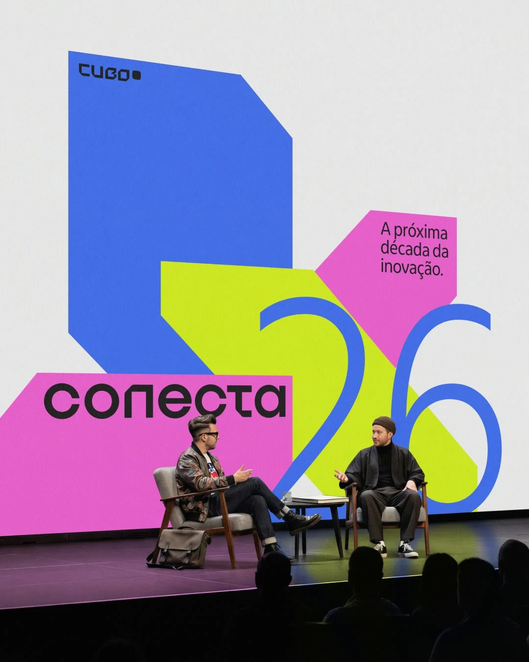
cubo conecta brings industries, startups, investors and executives together for cubo itaú's annual business event. the challenge was to express the movement and plurality of this network while building an identity that could carry recognition from one edition to the next. the system needed a lasting foundation and enough flexibility to reflect each year's conversations.
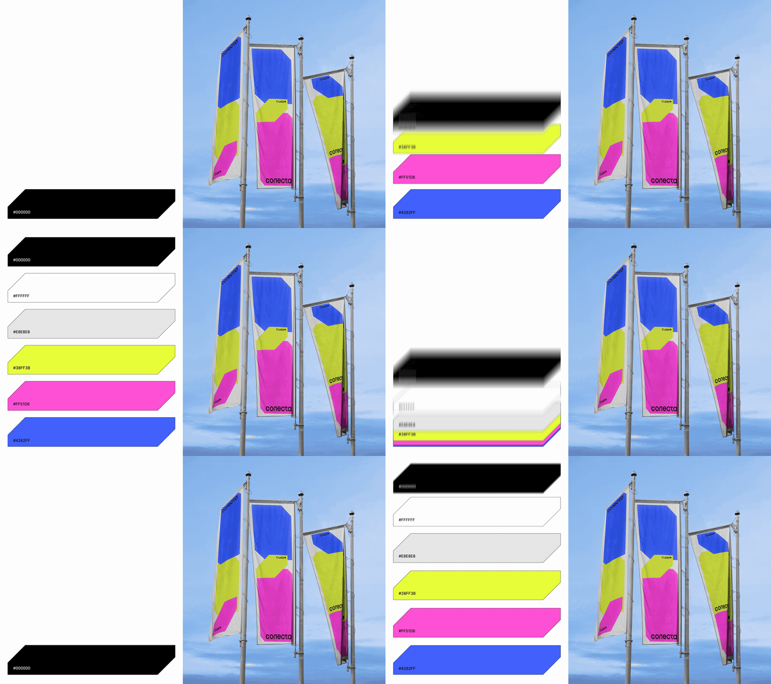
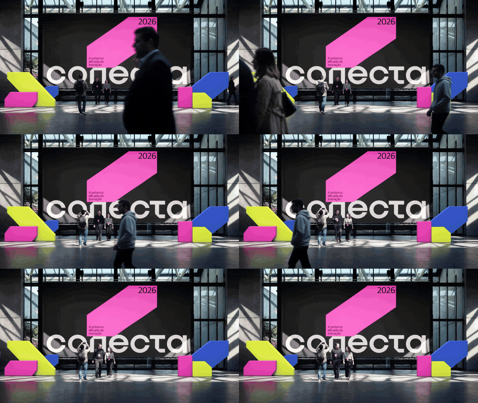
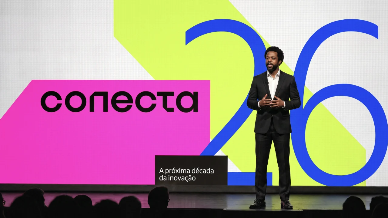
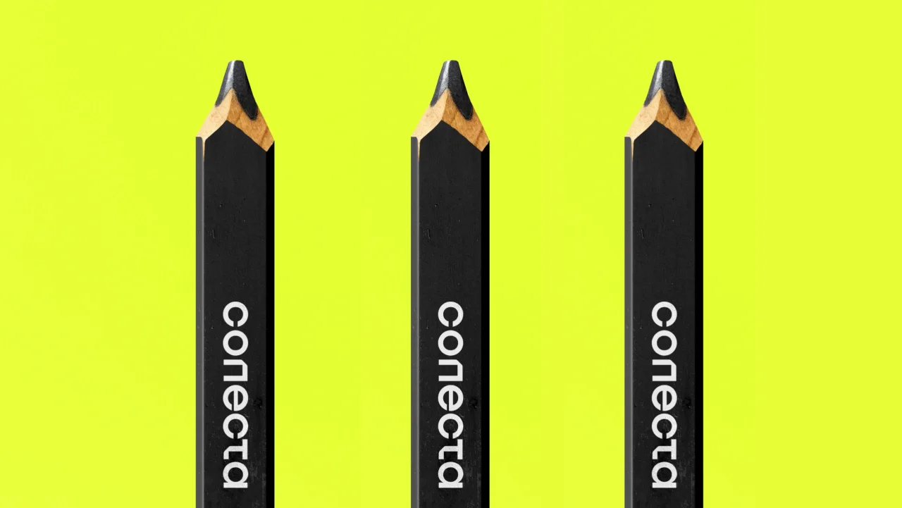
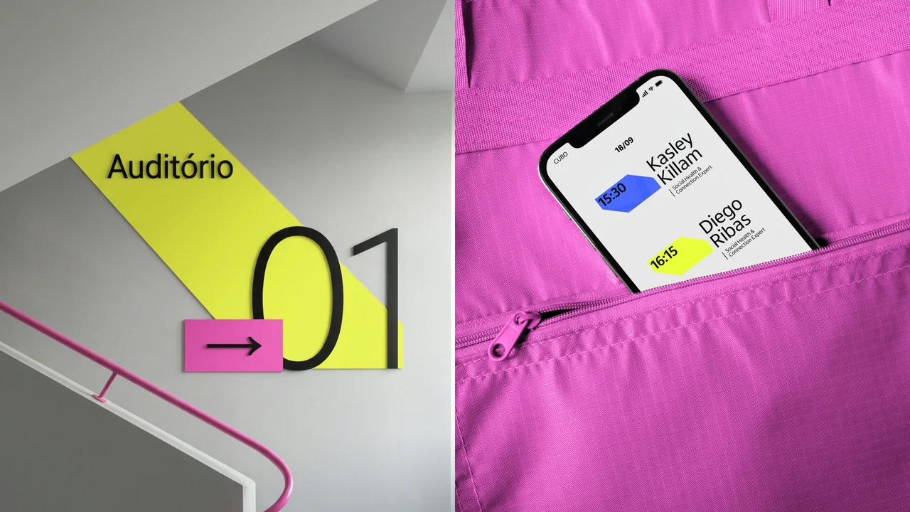
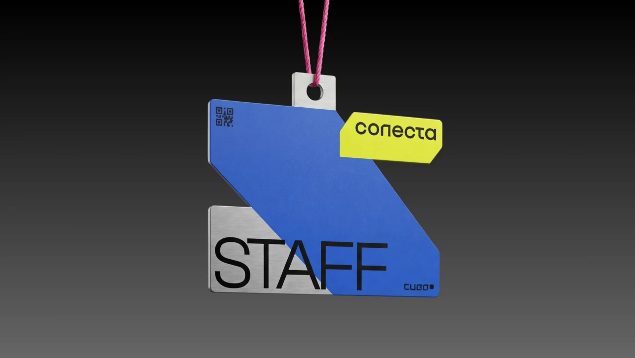
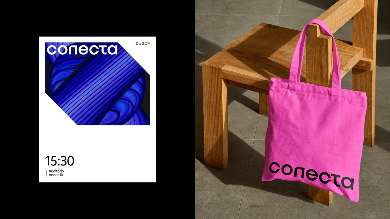
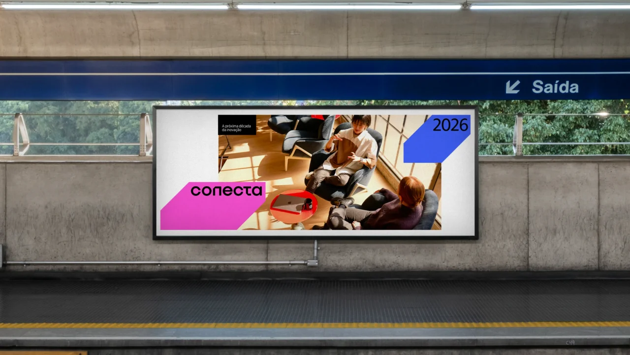
the square, an elementary form of the cubo brand, became the basis of a modular language. a permanent grid, typography and pink-and-blue palette establish continuity, while changing graphics, imagery and a third colour give each edition its own character. lime green marks the 2026 edition. modules expand, gain depth and recombine in motion, translating connection into a visual rhythm across stages, signage, badges and digital communication.


 rodrigo santos